Project overview
Sliced Bread Design was approached by the Monterey Bay Aquarium Research Institute (MBARI) to redesign the interface to control long-range autonomous underwater vehicles (LRAUVs).
The LRAUVs are controlled via an online interface to conduct sensing and sampling missions, but the skill level of users ranged from beginner volunteers and scientists to experienced engineers. Our goal was to create a design that would meet the needs of all the users.
Skills
UX design, user testing
Duration
Nov 2021 - Jan 2022
The challenge
The original interface was too intimidating
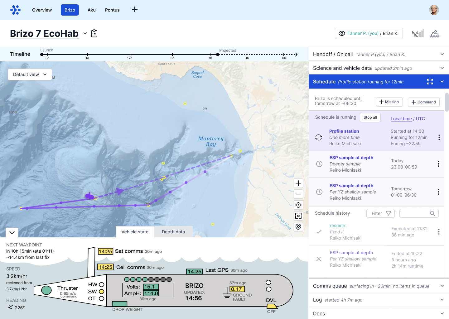
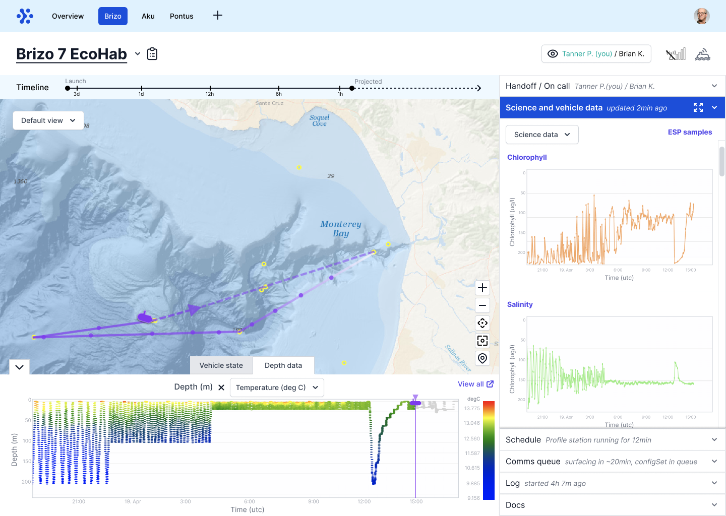
The main goal of the dashboard is to set up missions for the LRAUV to collect data. These missions can last for days and the vehicles need to be monitored for troubleshooting or assigning new missions by the on-call person. During watch handoffs, the new on-call person needs a quick way to understand the vehicle’s past actions, current state, and next steps.
The challenge was designing for users with vastly different experience levels and interests. Engineers with a high level of expertise wanted comprehensive detail, while scientists or volunteers with less experience only wanted relevant information, like incoming science data. The intimidating interface design also left users lacking confidence when they had to take action.
The original UI when you first log in
Creating a mission in the original UI
Getting oriented
This project began with phase one: user research conducted by UC Santa Cruz, and initial dashboard concepts that Sliced Bread and MBARI brainstormed together.
I joined in phase two to build on these concepts with detailed designs. I reviewed the prior work, assessed the remaining design needs, and created a project timeline that mapped design deliverables, user testing milestones, and a development schedule.
I also created a product requirements document to define user types, their needs, and required features with functional specifications. This served as an alignment tool with MBARI and guided design decisions throughout the project.
One of the initial concept sketches
Design and testing
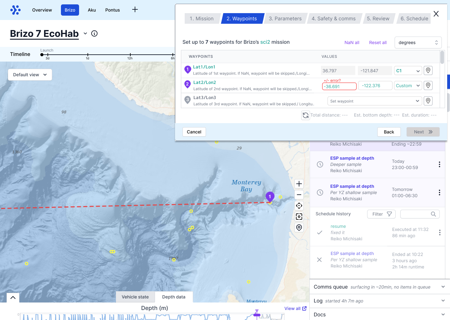
Designing key screens
Working with a colleague to divide responsibilities, I developed detailed designs for command building, data visualization, handoff, and battery monitoring. We created interactive prototypes and tested them with users at varying experience levels. I compiled the results into key findings that informed our next iteration:
Frequent/recent commands were used more than anticipated during mission and command creation
Users needed comprehensive timestamp information: last satellite/cell communication, next expected communication, mission duration, and launch time
Beginners wanted to see default parameter values as a reference when creating a mission
Many users needed guidance when configuring variables in the command builder
This first iteration of the command builder uncovered the need for more context for users with less experience
Users said they want to see the last communication with the vehicle and mission information at a glance, which wasn’t included in this earlier version
Refining and adding details
Based on the feedback, I focused on several key improvements:
Contextual command builder: Added descriptions for each configuration type to help users understand their options
Better communication visibility: Included last satellite/cell communication times in overview and LRAUV tabs, with estimates for the next communication window
Clearer command states: Redesigned icons to clearly indicate whether a command is waiting to transmit, transmitting, sent, and acknowledged by the LRAUV
Battery optimization guidance: Expanded information on suggestions for prolonging battery life
Adding descriptions for each configuration in the command builder
Presenting the communication state at the top with possible state combinations
Designing different icons to represent the transmission of the command
Offering a recommended suggestion with more context
Implementation
Post-launch refinement
After finalizing designs and handing off to our front-end engineer, the interface launched in February 2023. As users conducted real missions, they reported feedback and bugs on Github.
I returned to the project to triage Github issues and feature requests, organizing them into development bugs, implementation gaps, and new feature requests. I created new Figma designs for unaddressed needs, linked to existing designs that weren’t implemented yet, and connected each design to its specific Github issue for easy reference for our engineer.
The new feature requests helped identify user priorities: improving workflow usability (editing mission configurations, grouping parameters) and better visibility of critical information (last communications, low battery alerts).
A new design that allows users to reconfigure mission parameters while the mission is running
An updated design that shows the last comms under the comm states and in the Log tab of the menu
The impact
Better control and understanding
The redesigned interface enabled both novice volunteers and experienced engineers to effectively control the LRAUVs. Users particularly valued the intuitive design, with one volunteer stating, “I really like the timeline, map, and status up front and center and it’s neat to have the scheduler listed.” The improved design has allowed for more users to contribute to MBARI’s ocean research missions.