


Project overview
Sliced Bread Design partnered with Truss Works and the U.S. Digital Service (USDS) to take on a user-centered approach during the redesign of the military moving system.
The original moving process required a lot of paperwork and used an outdated online system that took 30 minutes just to log in. The goal was to turn it into an easy experience that could be done online and included the necessary resources to answer any questions people might have during their move.
Skills
Wireframing, user testing, UX design, responsive design
Duration
Sept. 2018 - May 2019
The Challenge
Lack of clear instructions for service members
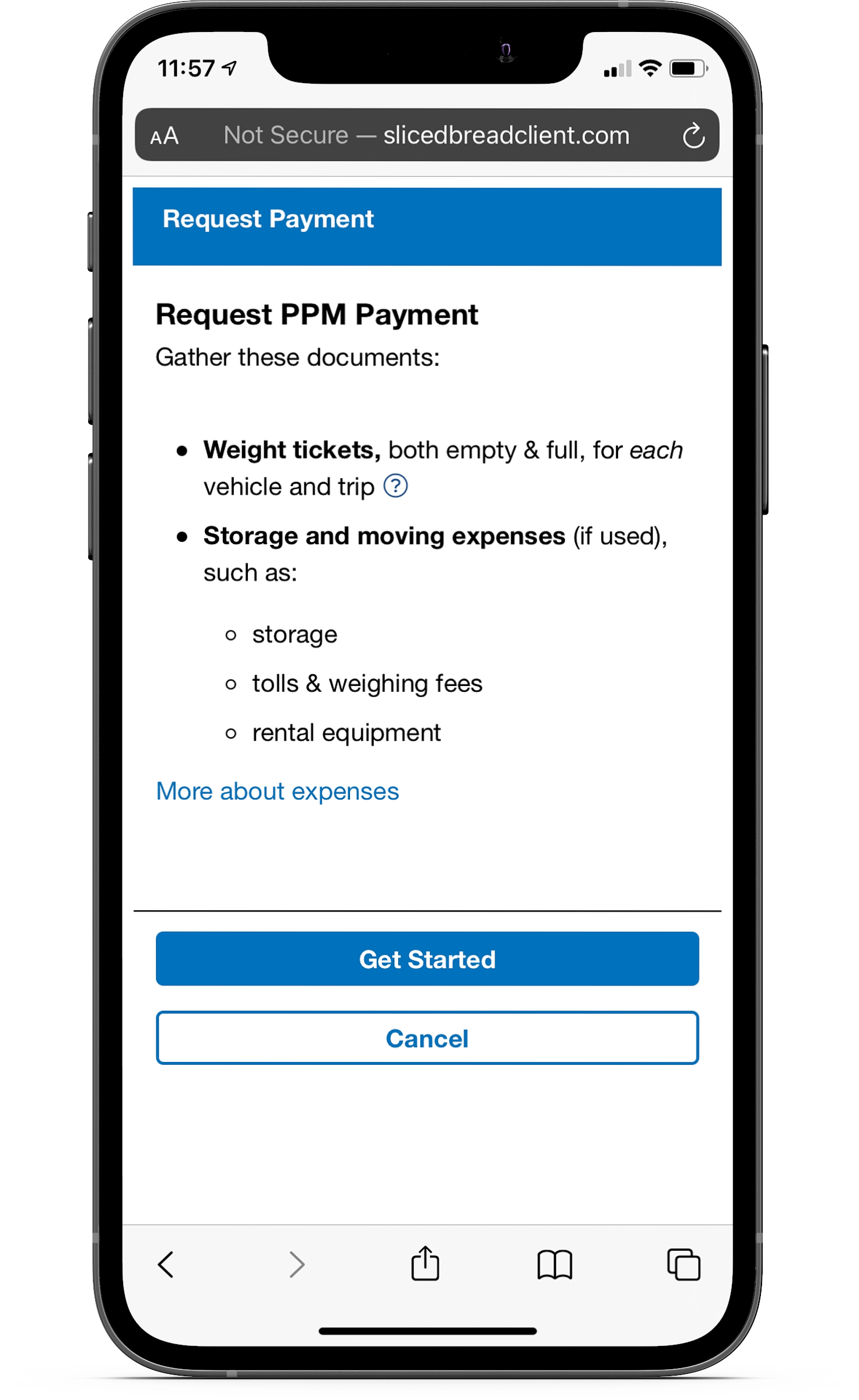
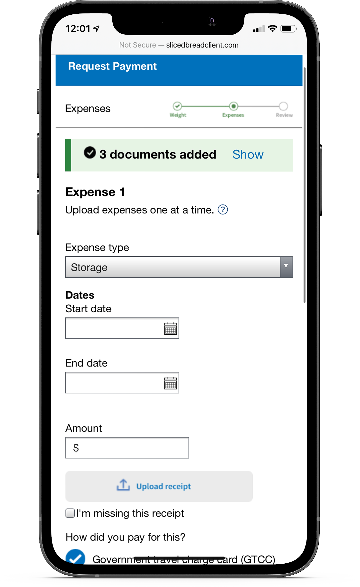
Service members receive a financial incentive based on the amount of weight they move or any moving expenses - as long as they have the receipts or weight tickets for submission.
One of the initial redesigns asked service members to upload every document type in one step. As users filled out information for each document, they often forgot to upload everything, leading them to submit for reimbursement without claiming all of their expenses. Even experienced movers ran into issues due to unclear instructions and confusion with the wording of the buttons.
One of the initial designs that caused a lot of confusion for the users
Insights
Key pain points to solve for
We narrowed down the key points to solve for based on feedback from the initial designs:
Service members need context before uploading to have time to gather documents or understand how to acquire them
Users forgot to upload all documents when every type was required in one step
Users need a way to track progress since they could have multiple documents
Notes from user testing
Initial sketches based on feedback
design
Initial ideas and iteration
Working with the team, I brainstormed and created several iterations for the document upload process. It was starting to move in the right direction when one iteration split the document types into separate steps.
As we tested these out, we realized some of the steps were asking for too much detail and adding some confusion. For example, asking for the number of vehicles at the start of the weight ticket step was unnecessary since there was an opportunity to edit that later. The steps for storage and expense receipts could also be combined, since storage receipts were an optional expense.
One of the first iterations where weight tickets, storage receipts, and expense receipts were broken up into separate steps.
Designing a wizard walkthrough
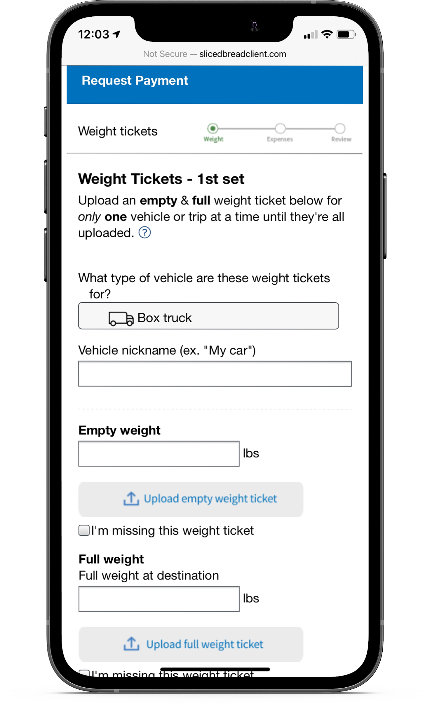
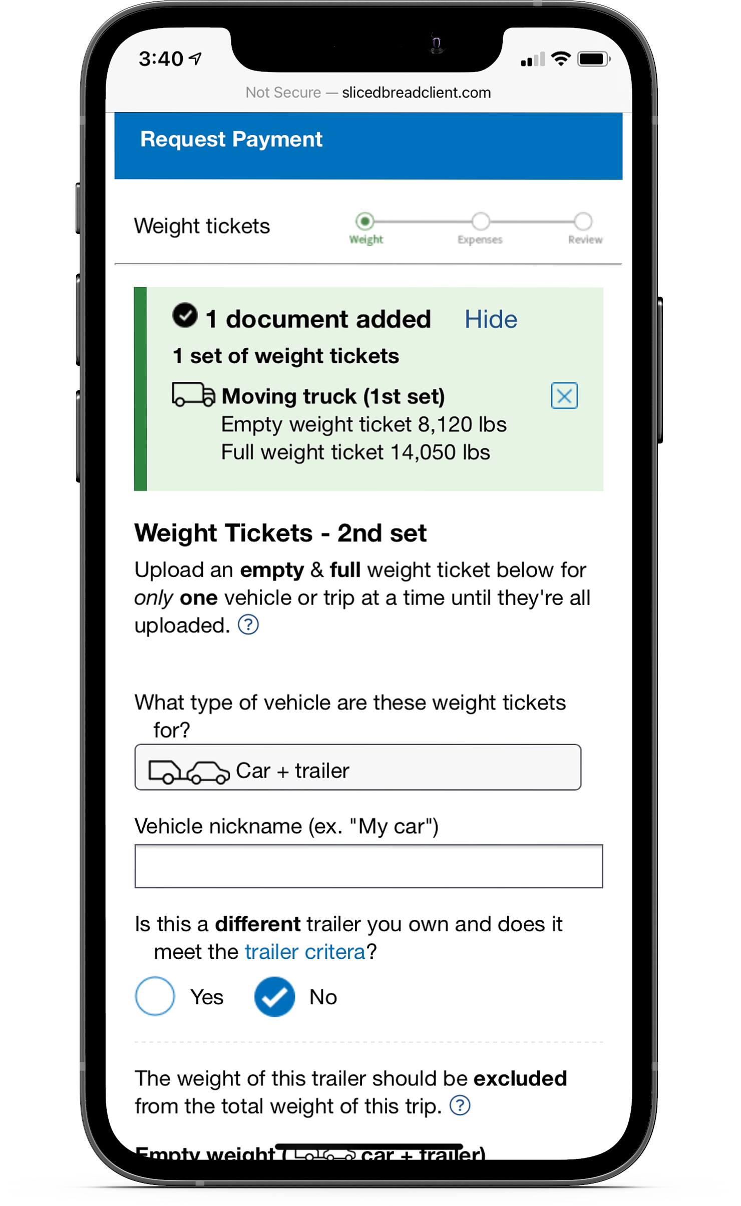
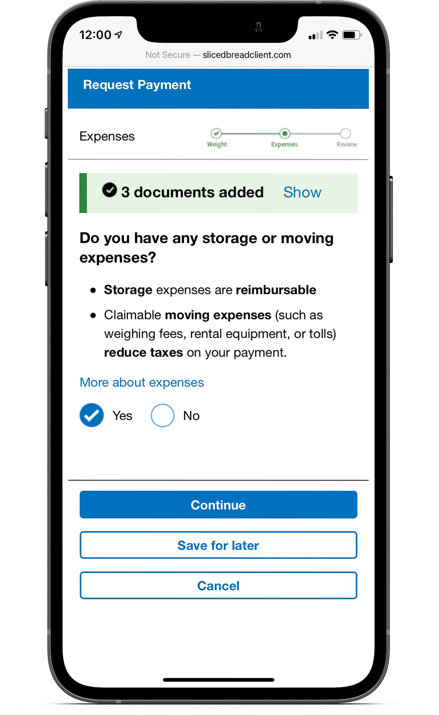
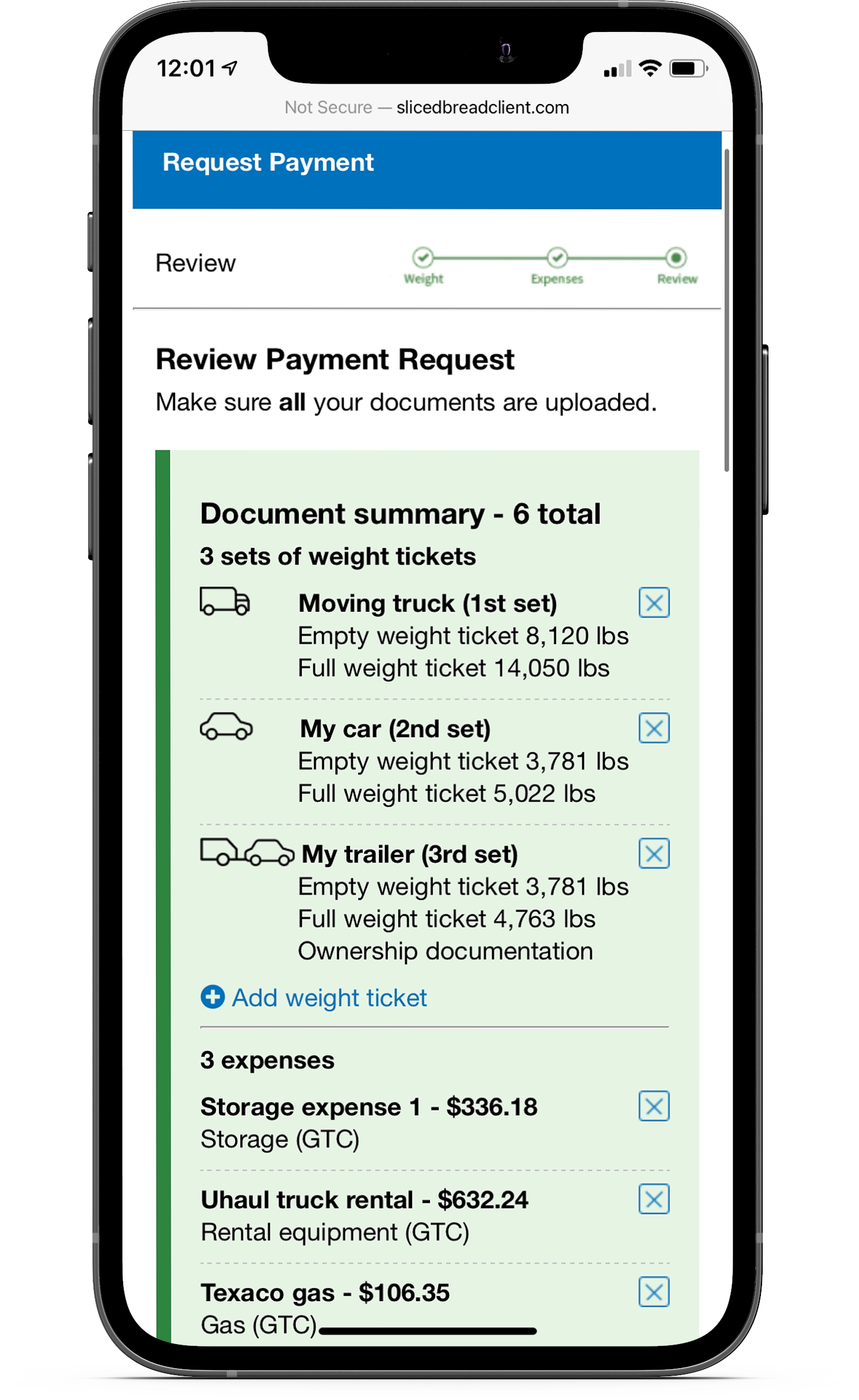
The final design transformed the upload process into a wizard experience. Service members were guided through the process, having them begin with uploading weight tickets, then presenting an interstitial screen as a reminder for uploading expense receipts.
A progress section was also designed to show the user all the documents they’ve uploaded up to that point, allowing service members to review submissions and make any changes if necessary. This was also helpful for users who had to leave and come back later to finish the process.

Providing additional help
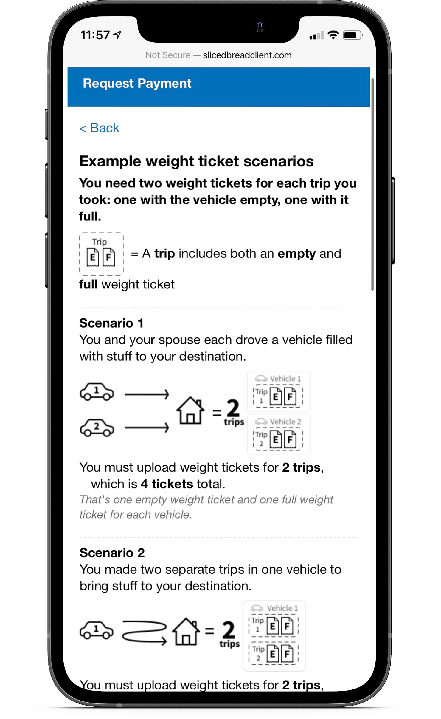
User testing also revealed the need for more context throughout several points in the flow. One problem in particular was the uncertainty around the number of weight tickets needed and how it worked with a rented or owned trailer. I designed a help page illustrating different scenarios to explain how many weight tickets they needed based on their situation.
Prototyping
Creating a mobile-first prototype
I built interactive prototypes focusing on a mobile interface, since service members primarily used their phones for the moving process. These prototypes were presented on demo days for feedback from the developers and service members, then handed off to the engineers after iterations were complete.
I conducted a few design reviews throughout implementation to ensure accurate execution and discuss any necessary adjustments.
The impact
A faster and more accurate process
The pilot program launched in 2019, with a significant decrease in the amount of time and errors that service members experienced previously. The formerly two-hour process and two-week wait was reduced to a 10-minute online process with instant processing. The previous 58% error rate also dropped down to 12%, with reimbursement wait time going from three months to just four weeks.