Project overview
Sliced Bread Design partnered with Truss Works and the U.S. Digital Service (USDS) to take on a user-centered approach during the redesign of the military moving system.
The original moving process required a lot of paperwork and used an outdated online system that took 30 minutes just to log in. The goal was to turn it into an easy experience that could be done online and included the necessary resources to answer any questions people might have during their move.
Skills
Responsive design, system design, wireframing, research
Duration
Sept. 2018 - May 2019
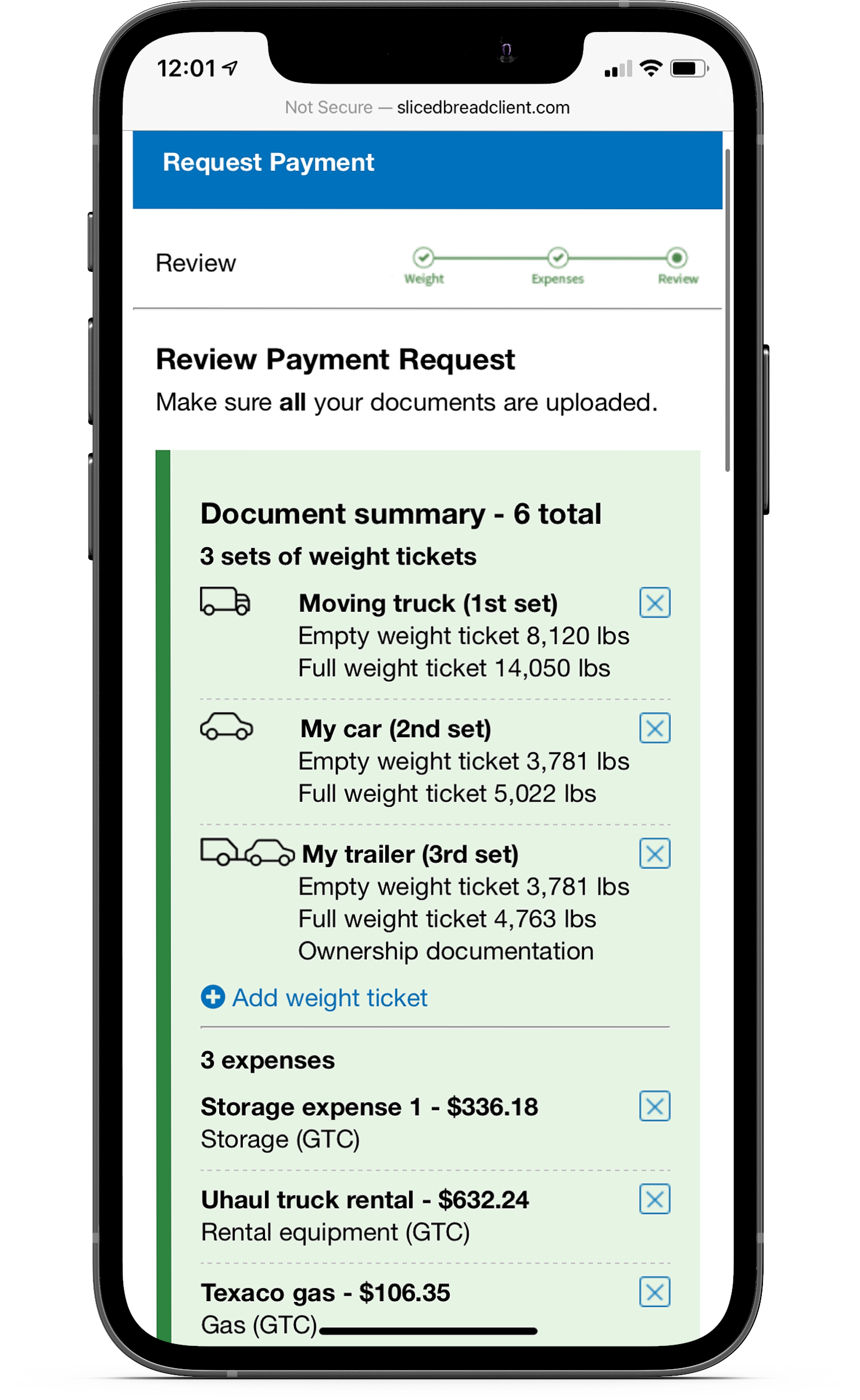
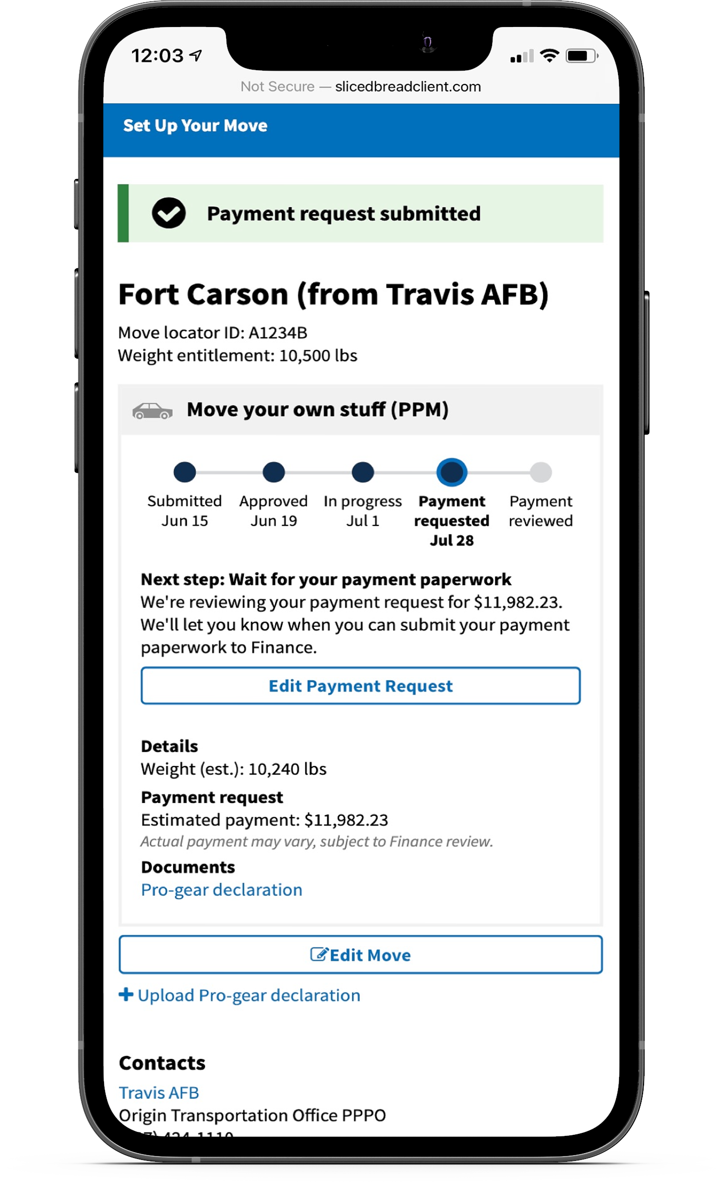
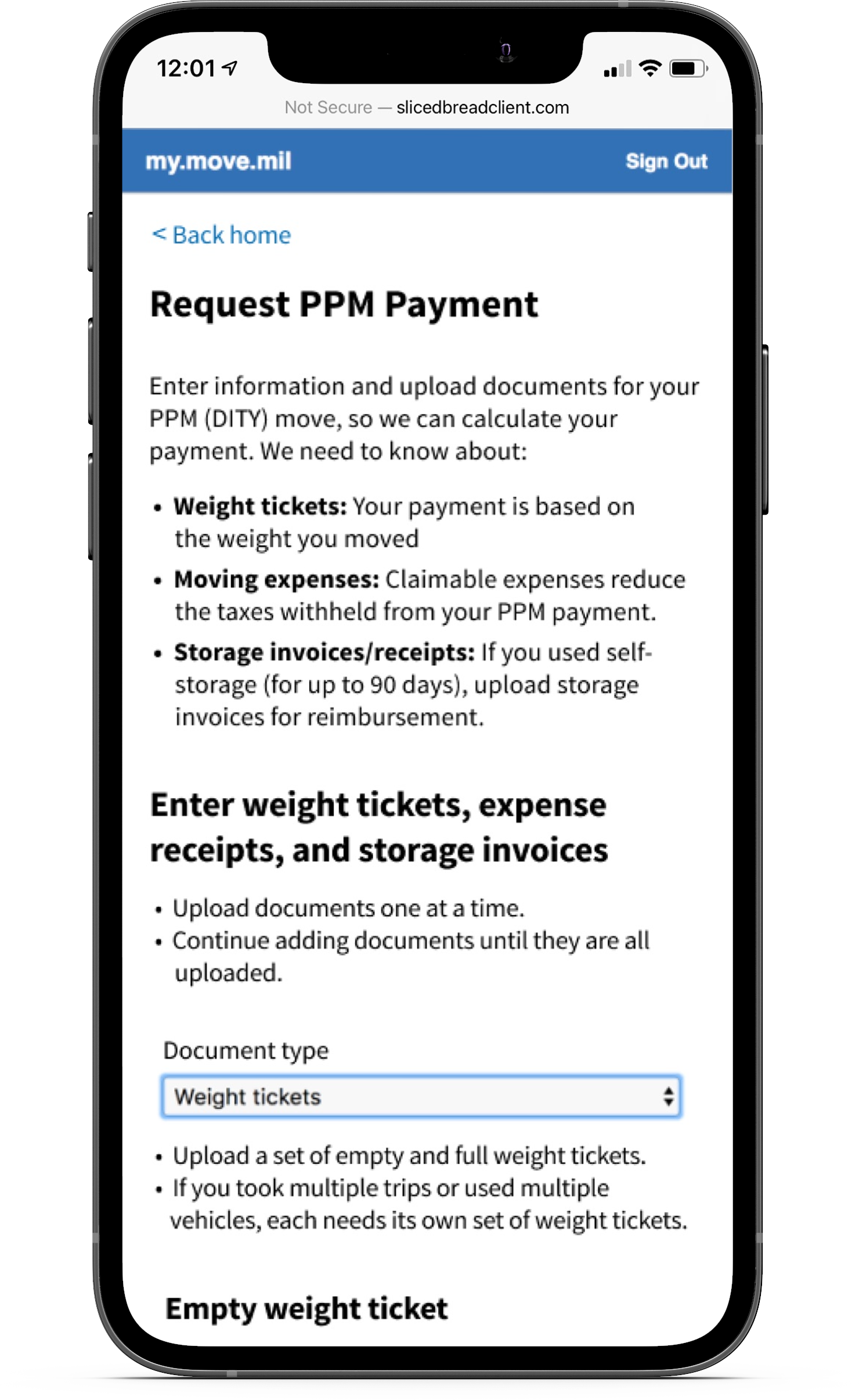
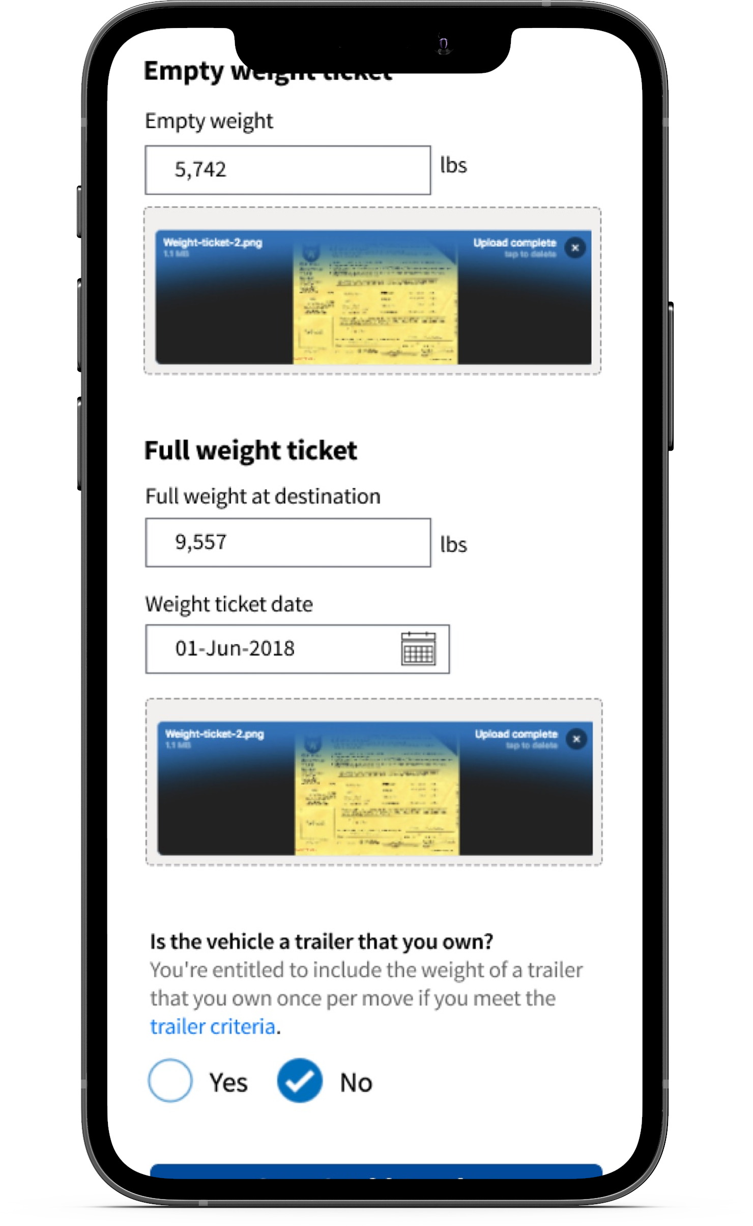
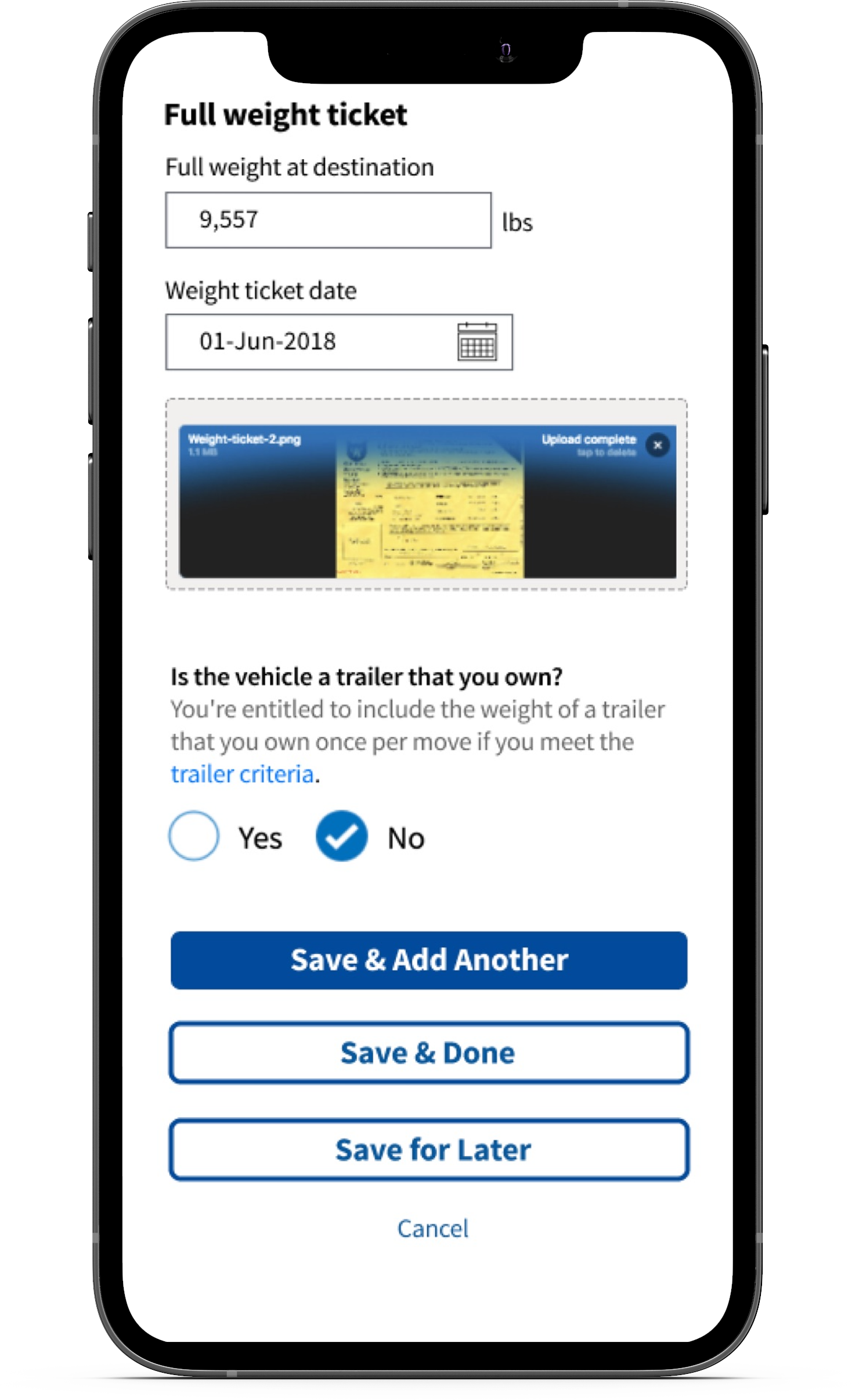
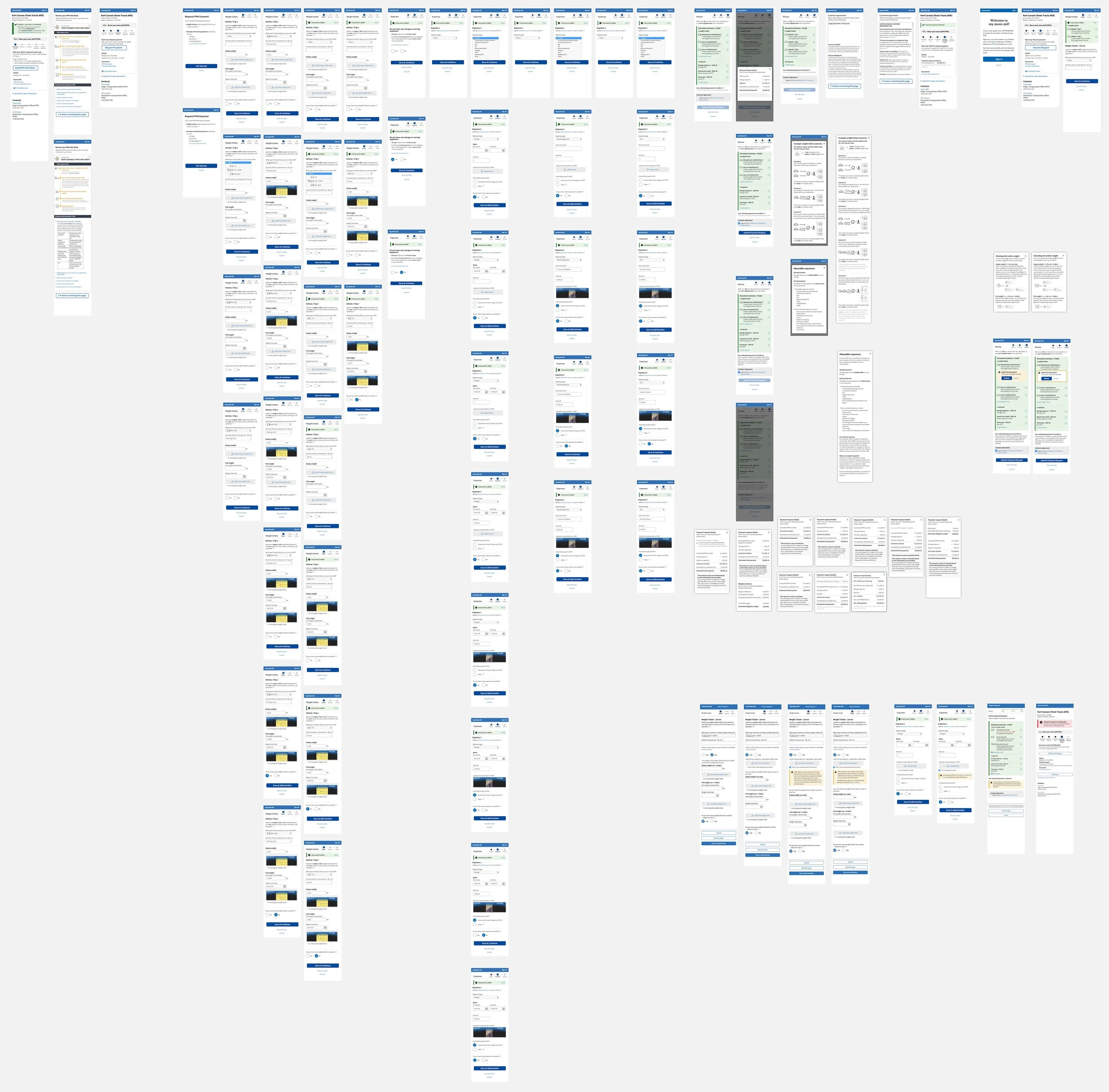
Final designs
The Challenge
Lack of clear instructions for service members
Service members receive a financial incentive based on the amount of weight they move or any moving expenses - as long as they have the receipts. When they started the process, they often weren’t aware of what documents they needed on hand to receive their reimbursement.
One of the original designs asked upfront for every type of document service members could have received throughout the moving process. This led to a lot of confusion because service members forgot they had to upload the other documents - even for members that have moved before, the lack of instructions still caused them to run into issues.
Insights and design
Key pain points to solve for
Based on the feedback for the original designs, I identified key pain points to solve for:
Service members need context before uploading documents so they have time to gather what they need
Many users forgot they had to upload other documents since every document type was required in one step
Newer service members often weren’t sure what the documents were or how to get them
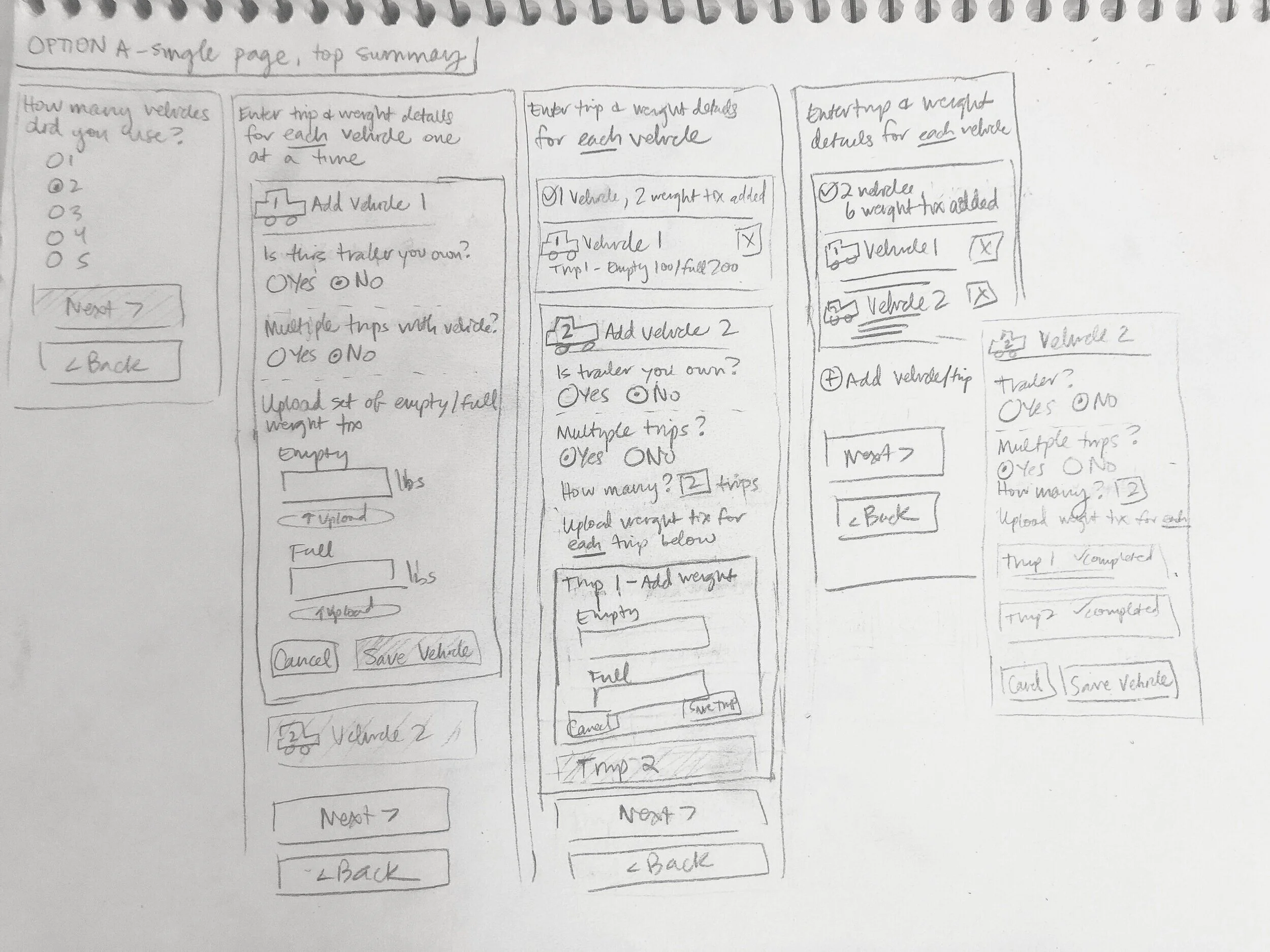
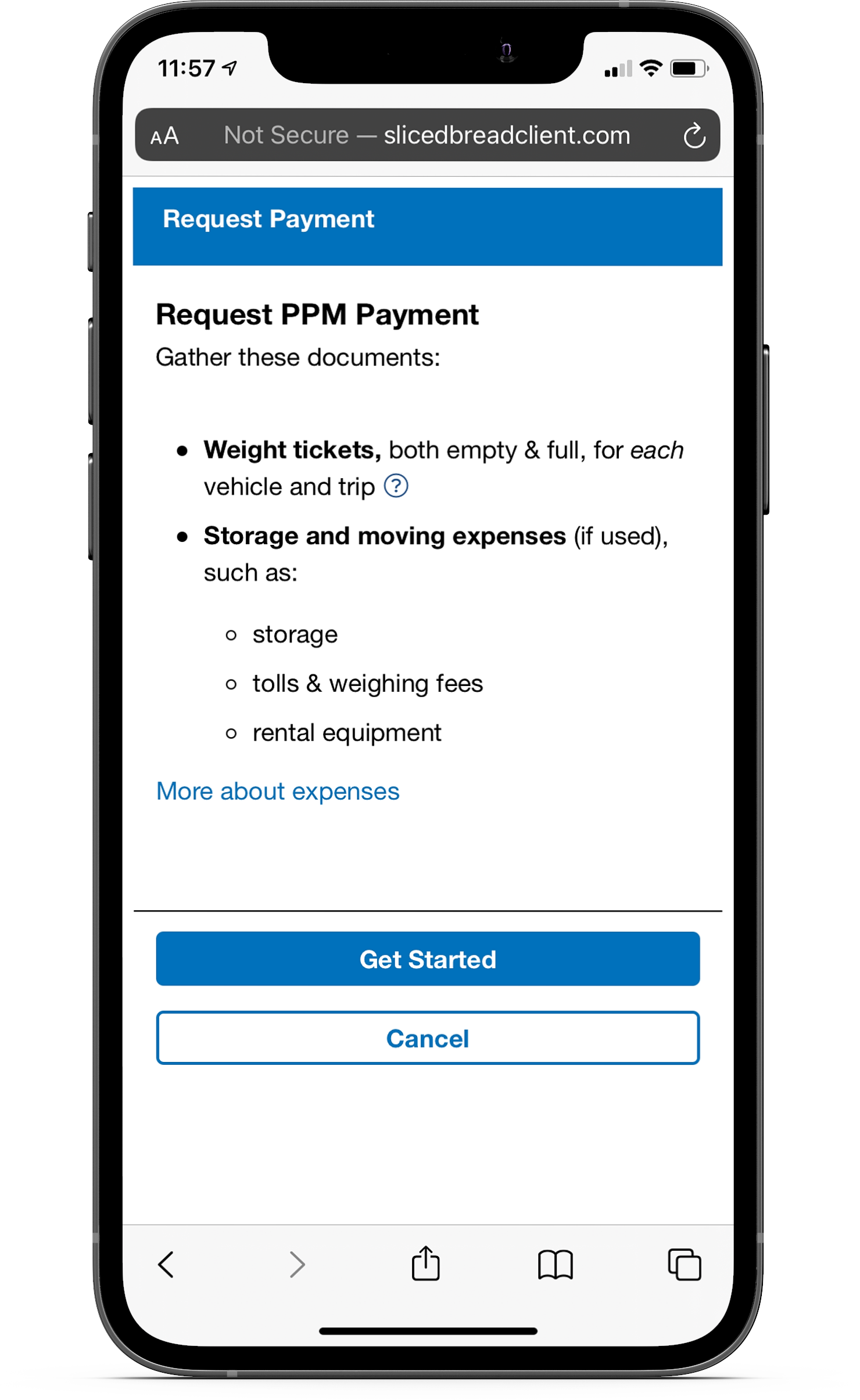
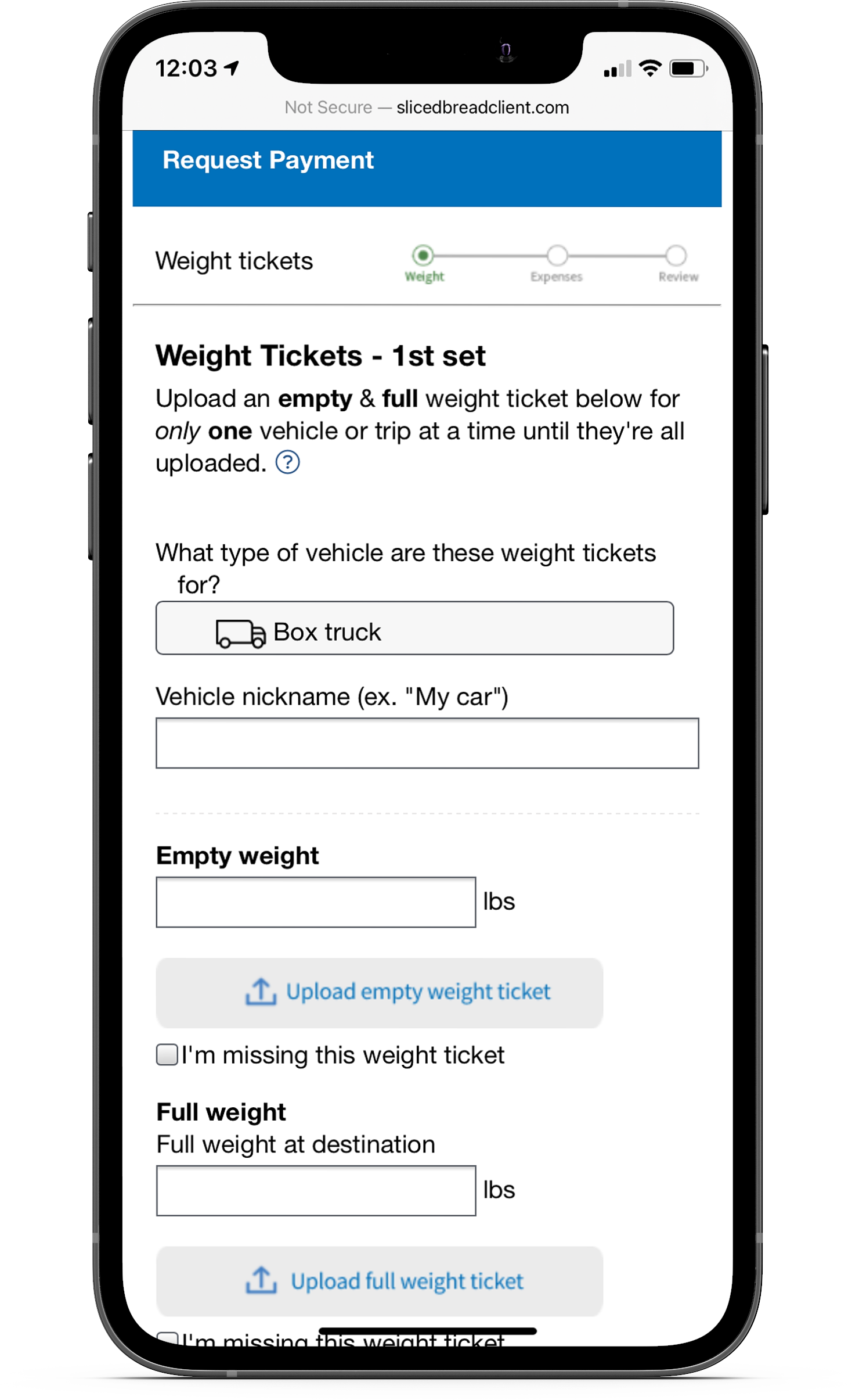
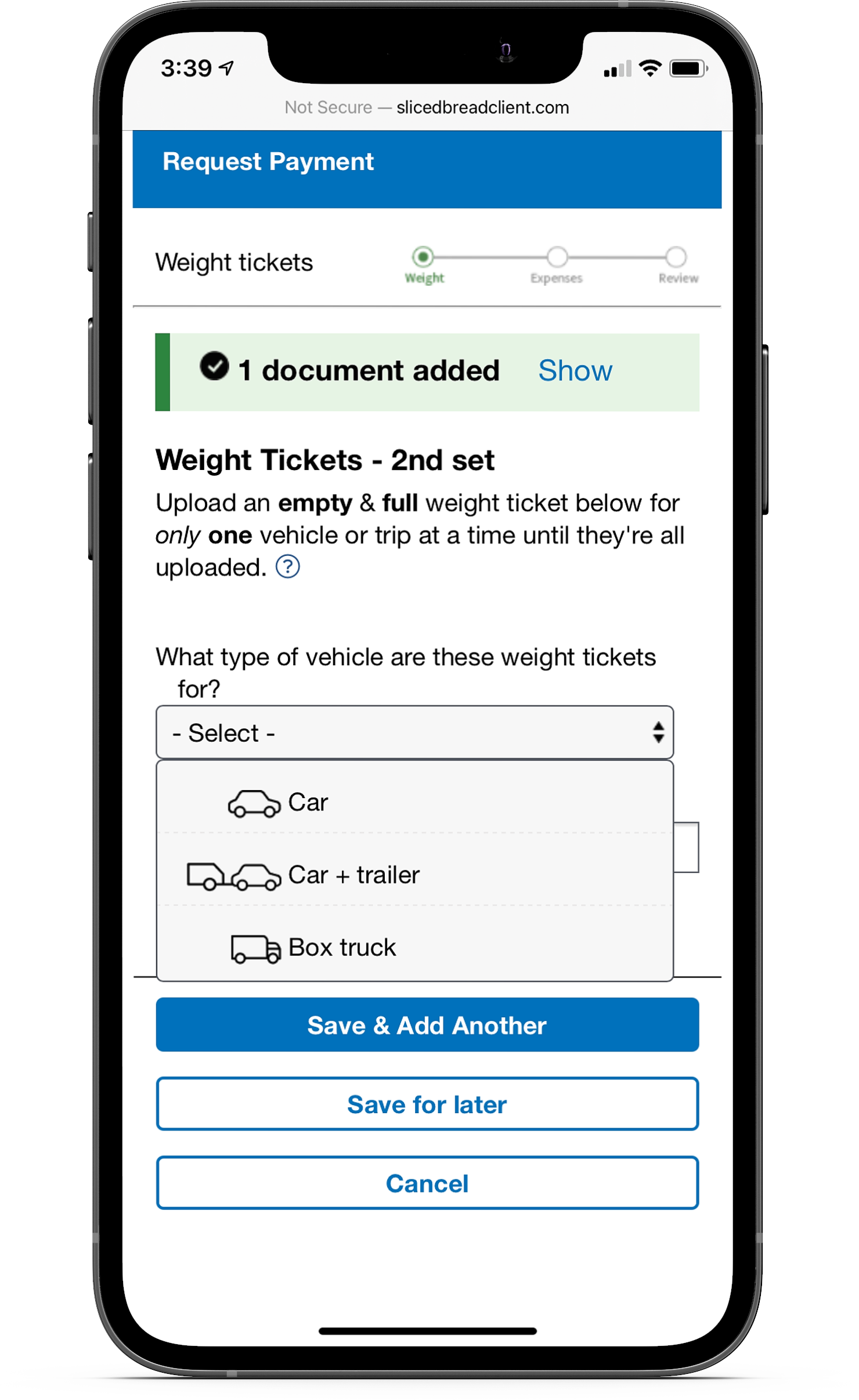
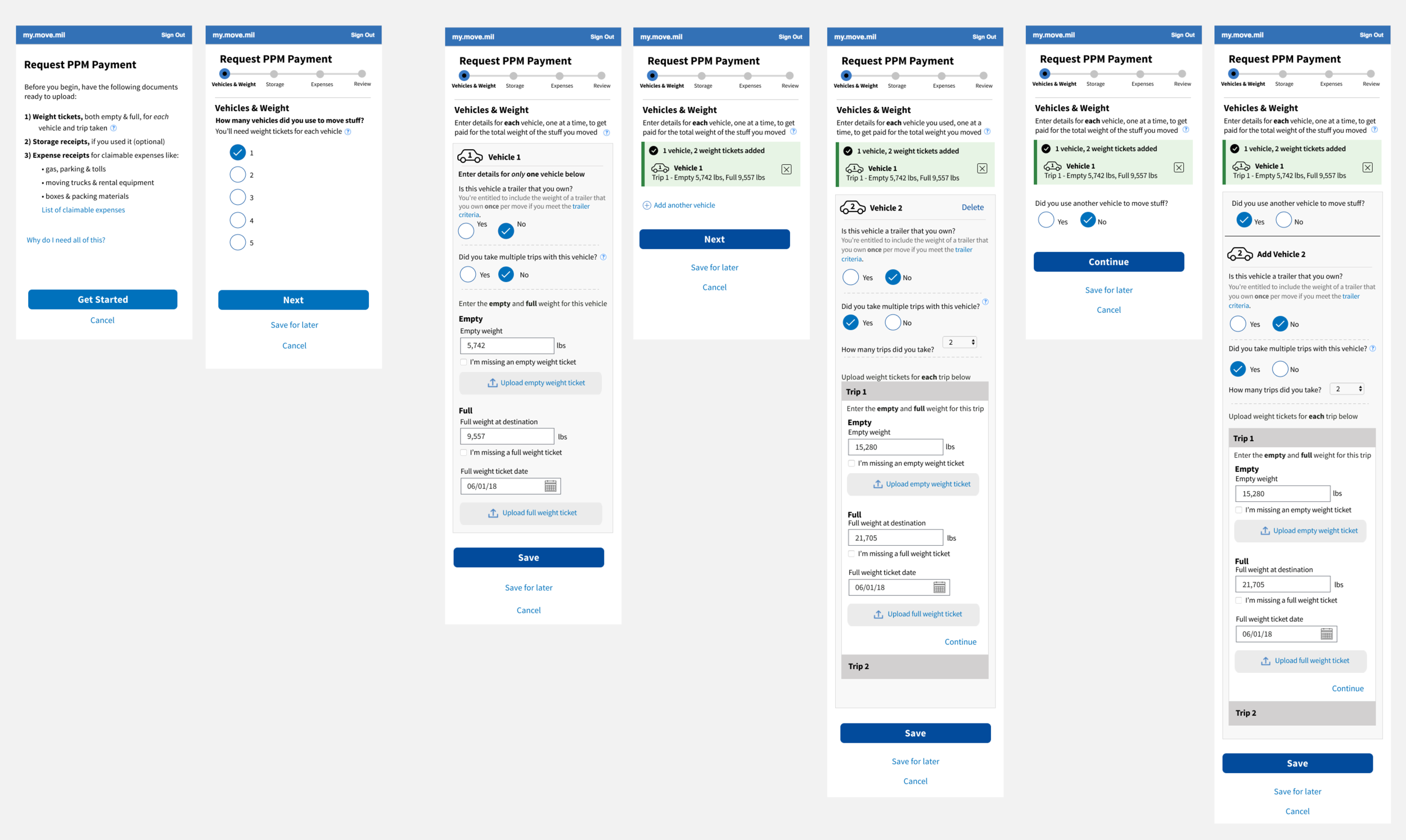
Creating a detailed walkthrough
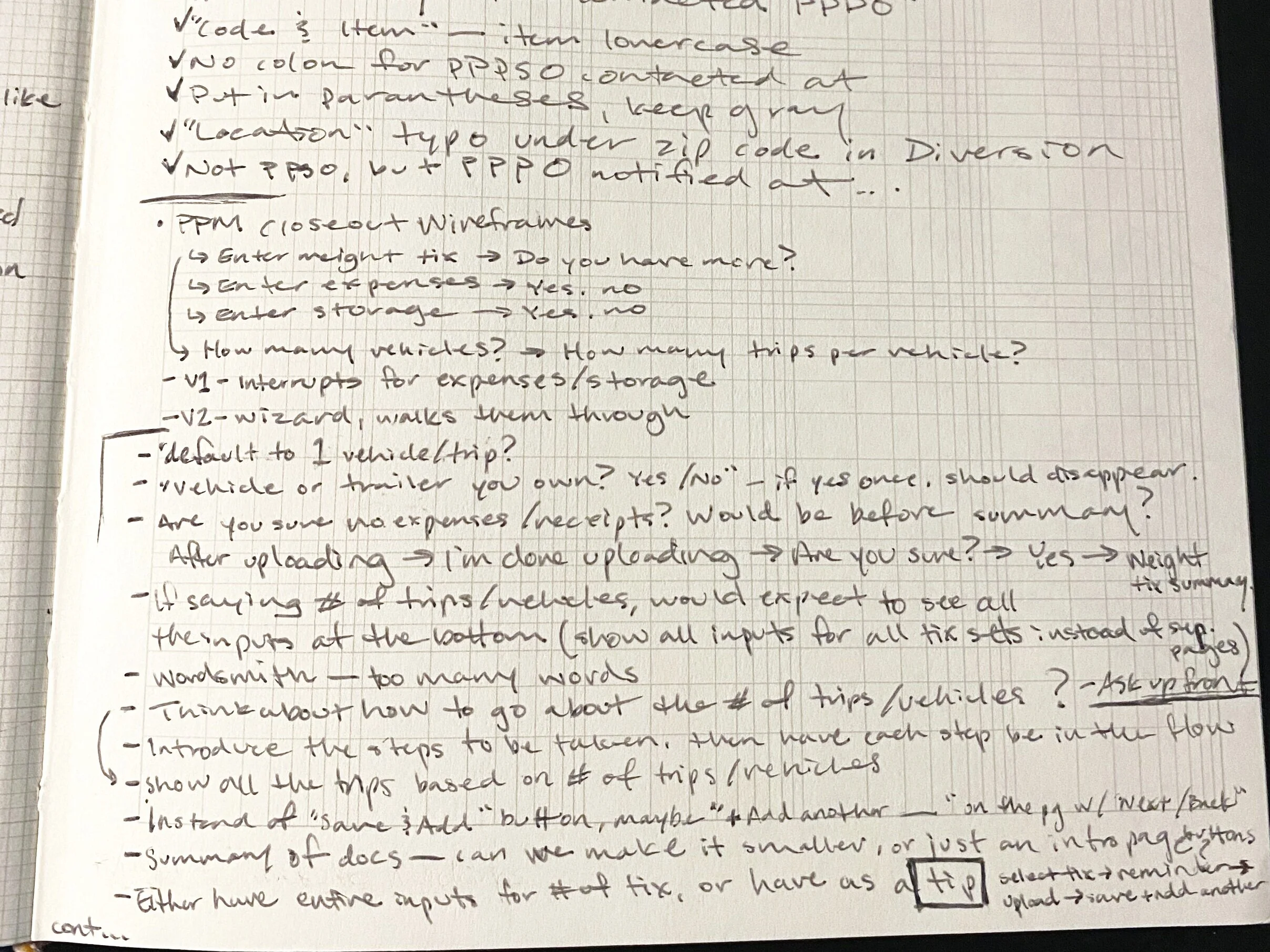
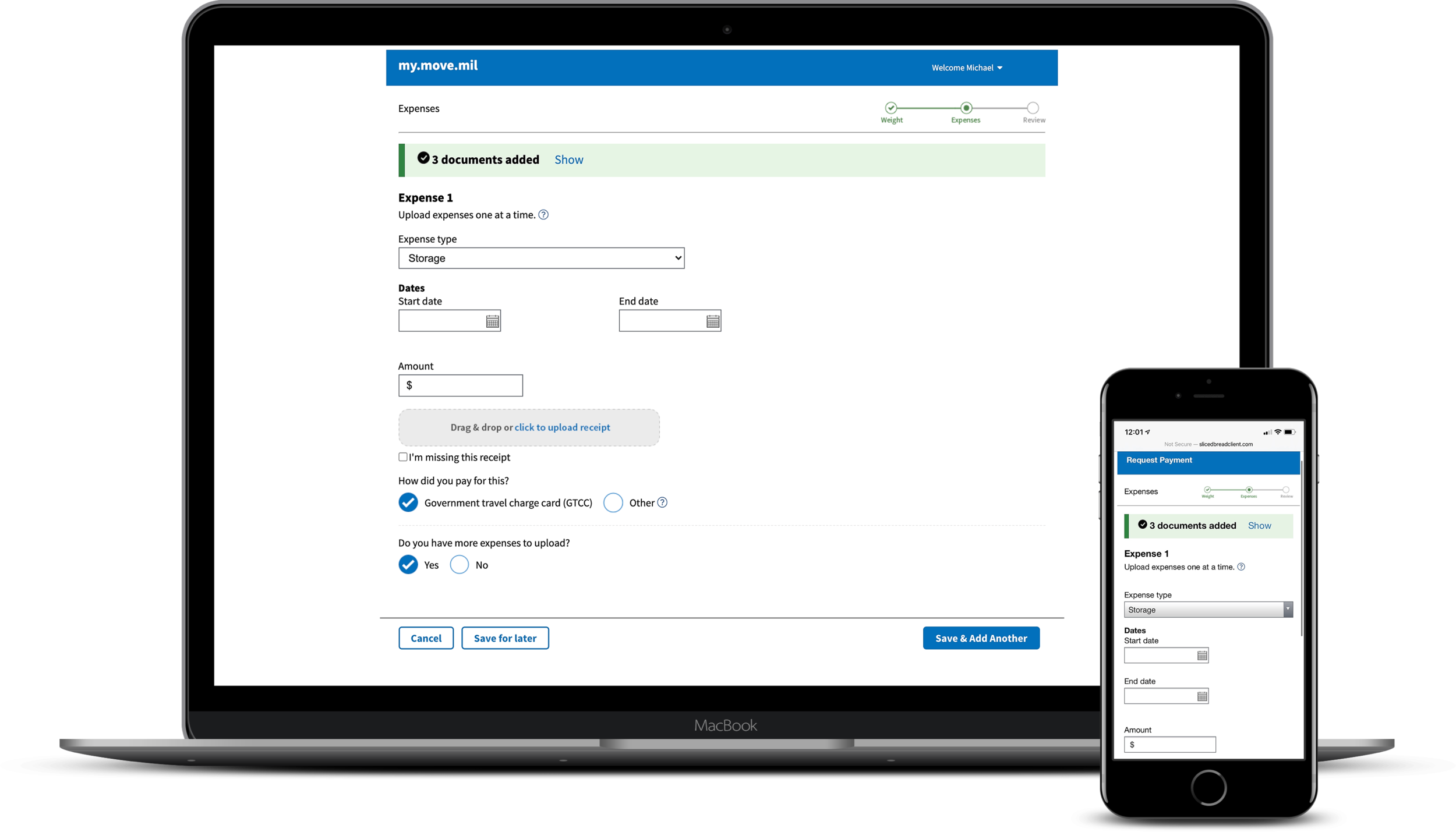
I created several iterations for the document upload process to test out what worked best for the service members. One iteration asked service members to indicate what documents they had to upload, but this still had the same problem of forgetting they had more documents to upload after the first batch.
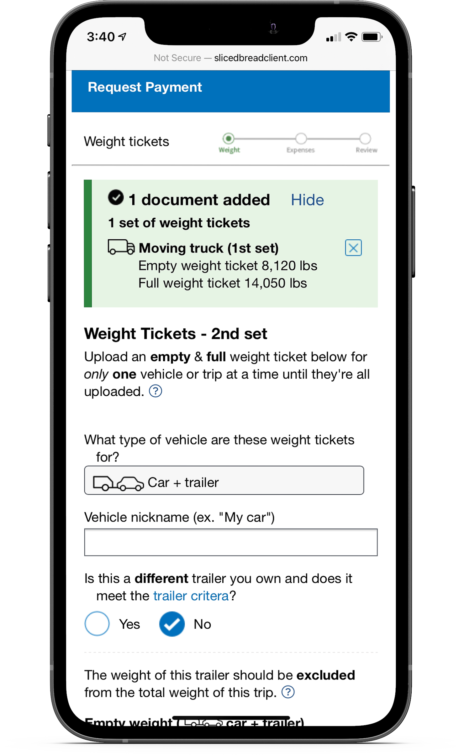
After some more testing and iterations, the final flow didn’t give service members a choice between which documents to upload first. Instead, they were asked to first upload their weight tickets, then after uploading all of those documents, they would see an interstitial screen that asked if they had any expense receipts to submit. This acted as a reminder for service members to ensure they didn’t forget halfway through.
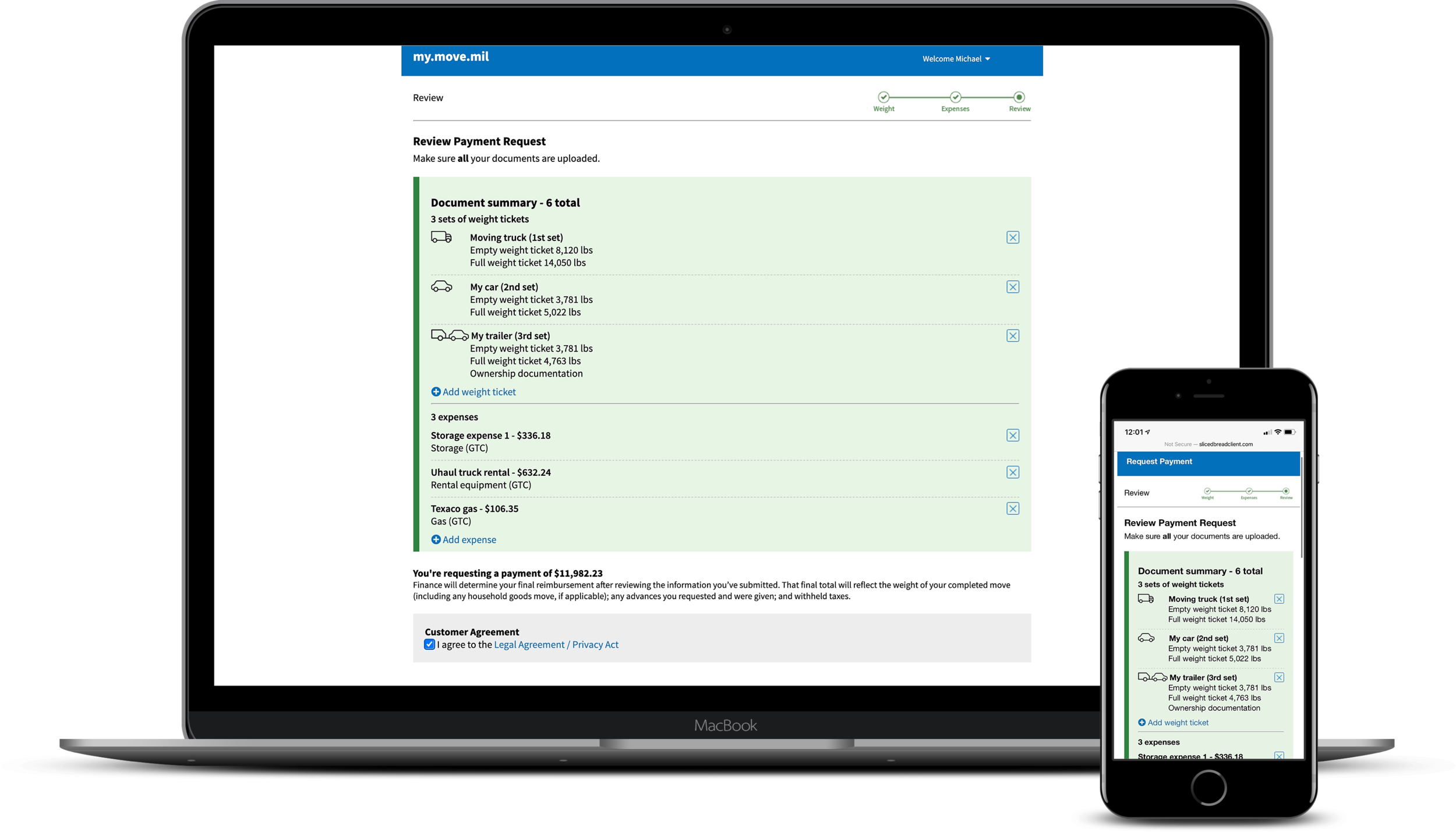
I also added a progress section that showed the user all the documents they’ve uploaded up to that point. That way, they could review what they submitted so far to keep track of where they were in the process and go back to make any changes if necessary. This worked well for service members who had to leave and come back later to finish the uploading process.
Providing additional help
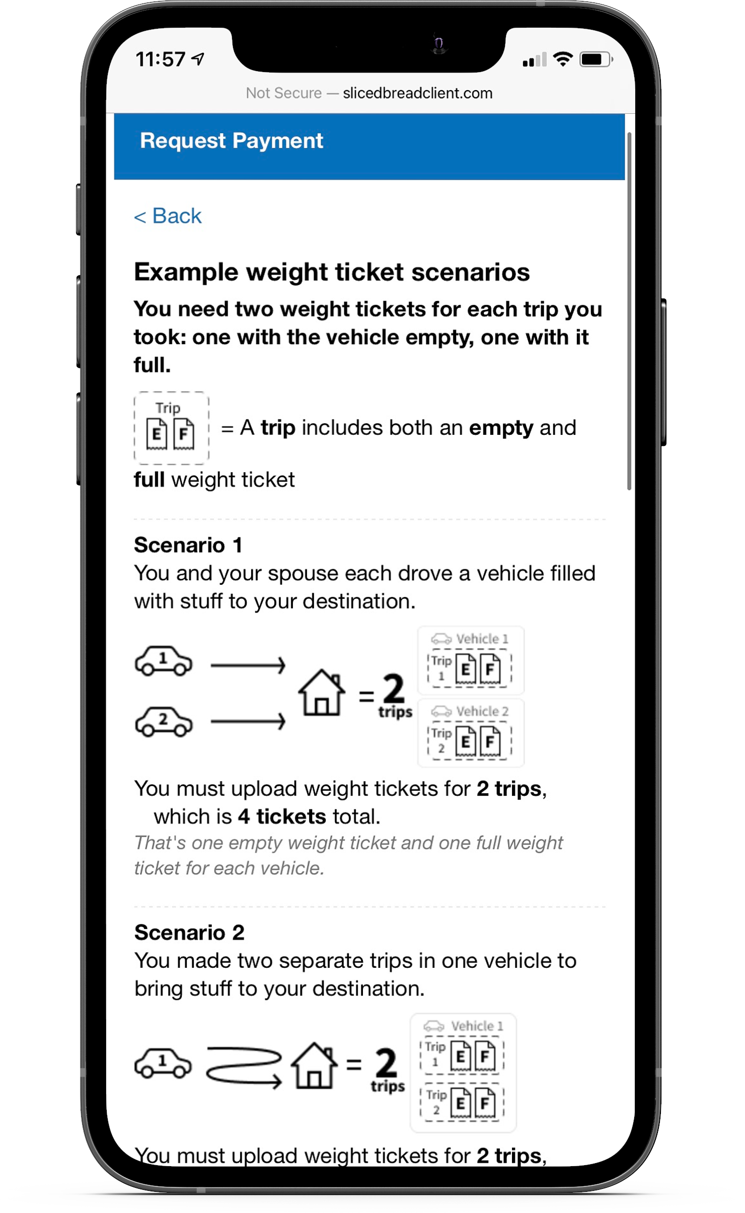
There were several points throughout the flow where we realized the service members needed more context. One problem that stood out was the uncertainty service members had around the number of weight tickets they needed or how weight tickets worked with a rented or owned trailer. I designed a specific help page that illustrated different potential scenarios the service members could have taken in order to explain how many weight tickets they would need.
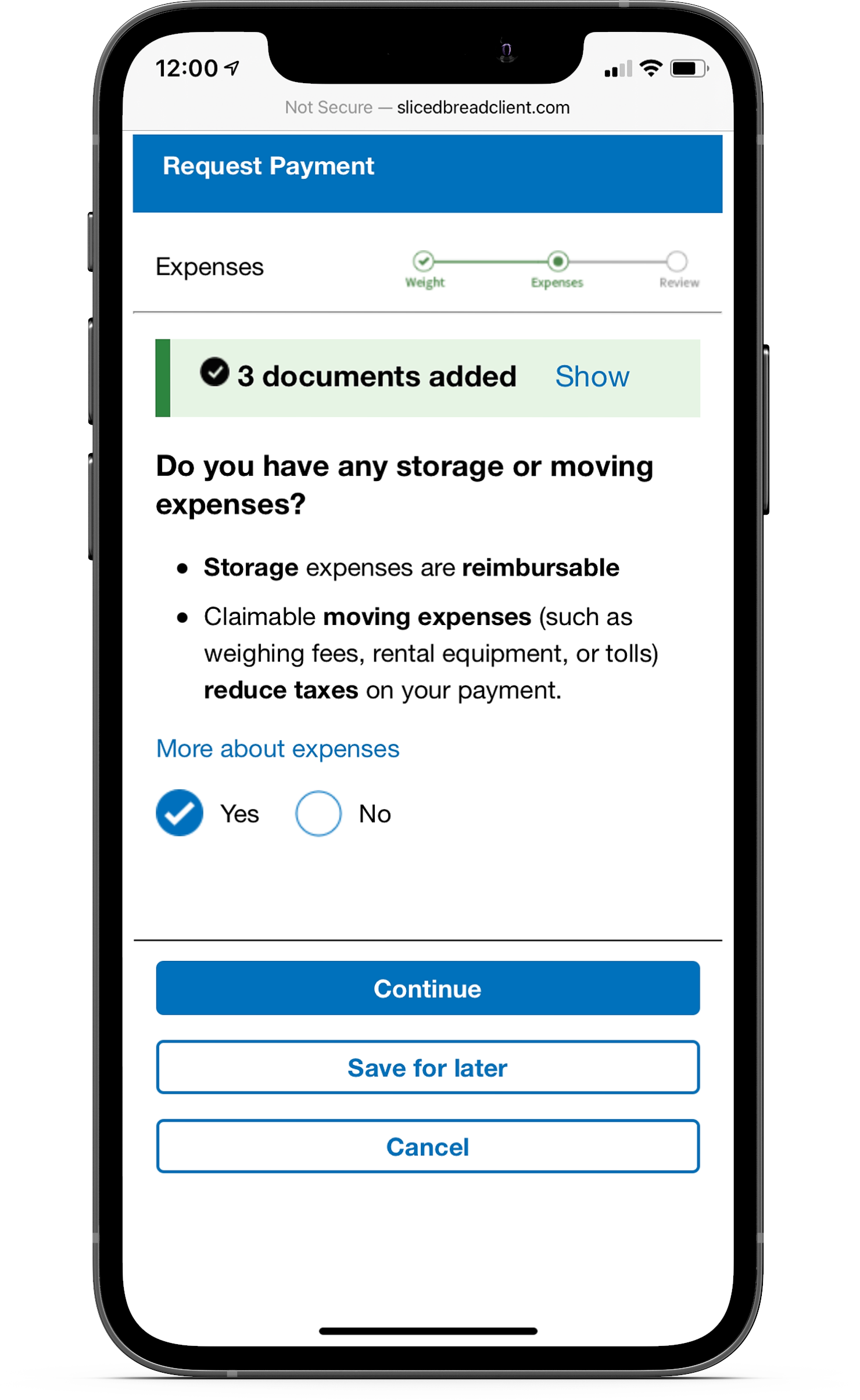
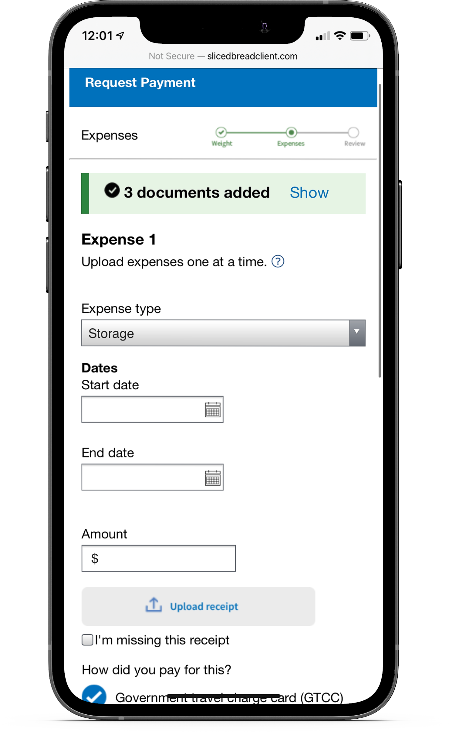
I also included a tooltip to explain what sort of expenses could be claimed by service members for reimbursement.
Prototyping
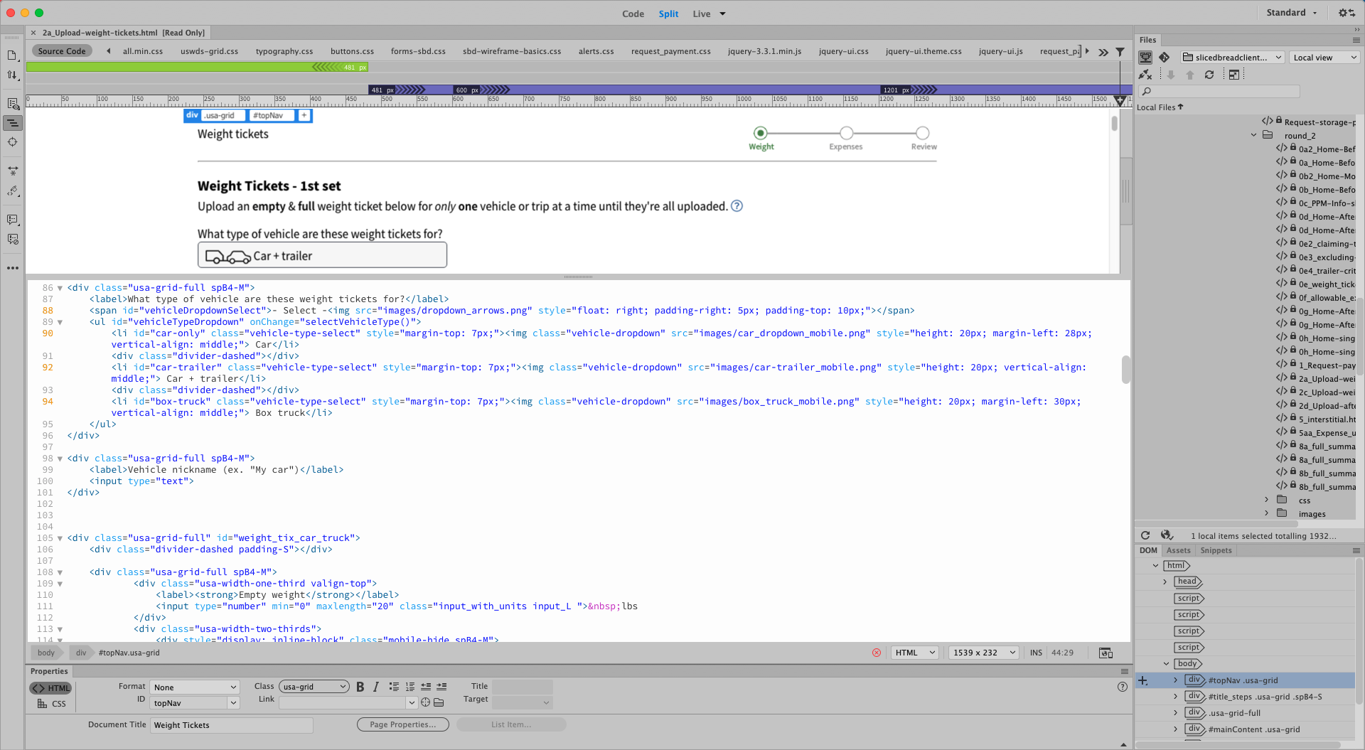
html & css
I built the prototypes using HTML and CSS in Dreamweaver. There was some Javascript written in to show the state changes in each part of the flow after an action is taken.
Since service members primarily use their phones for the moving process, all of the Figma designs were made for mobile. We used the USWDS responsive grid system so that it could easily be used for web.
I presented the prototypes on demo days to get feedback from the developers and service members. Once any final changes were made, they were handed off to the engineers.
Final implementation
As the developers built the page, we did design reviews along the way to make sure the page was looking and working the way it should be. Whenever the engineers were ready, we would have a final demo to show the client the work that was done.

Other designs I worked on
Service blueprint
Towards the end of the project, I created a service blueprint to give a comprehensive understanding of how the people, elements, and processes all tie together. It helped us get an overview of what areas of the process were covered by the new designs and what areas to work on next.

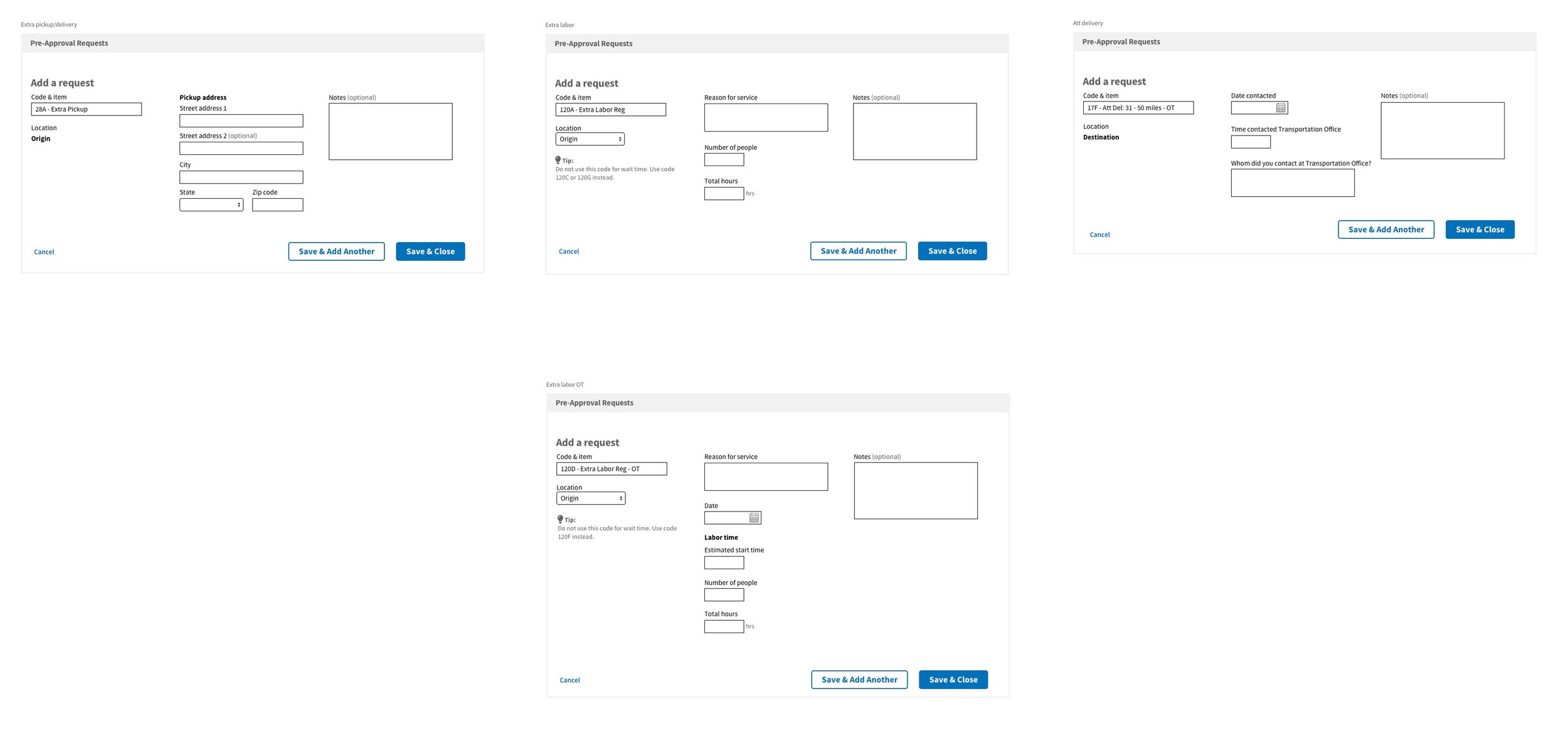
Accessorial fields
One part of moving included getting pre-approvals for accessorial charges. Each type of accessorial required different information that had to be submitted, so we sat down with the office members to go through each item in detail.
I created Sketch wireframes to show the field layouts of each accessorial and reviewed them with the office members. Tips were added to clarify what content is needed for certain fields or to shed some light on what the accessorial is in case someone was confused.
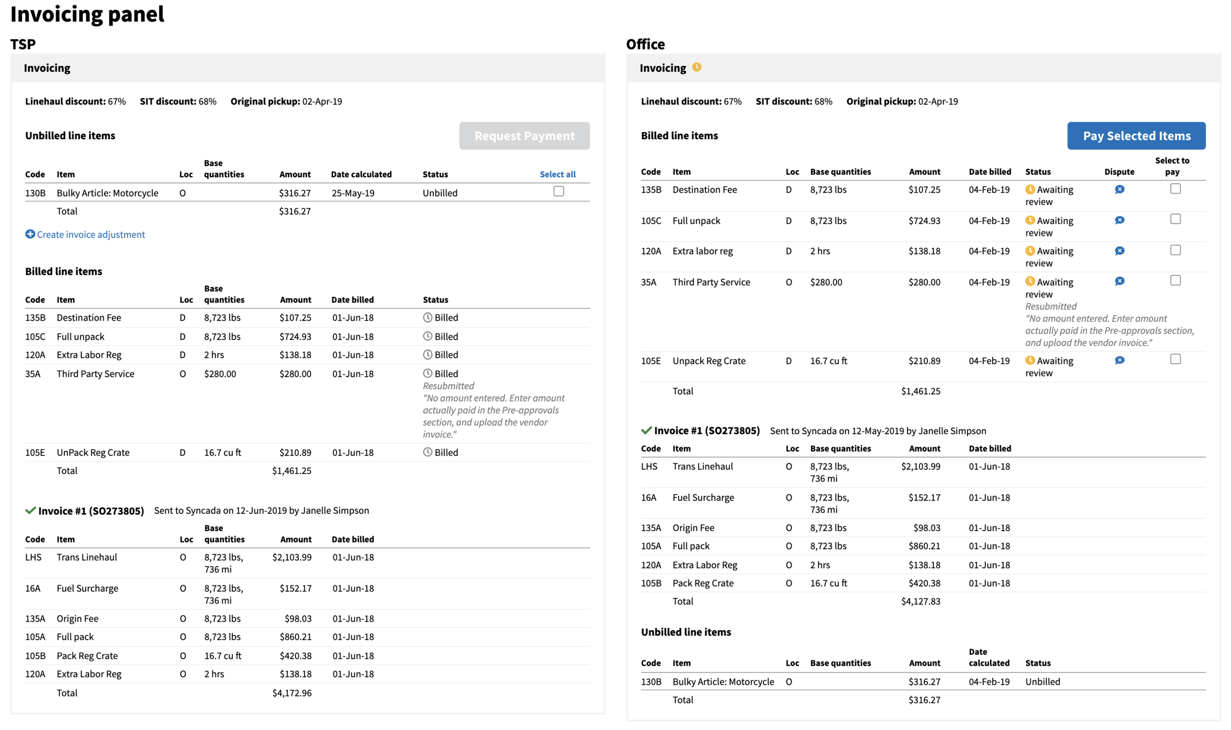
Office invoicing
After the service member is done moving, the transportation provider will submit an invoice to the administrative office for the accessorial charges. The office then reviews and pays the bill. However, the original design only allowed for bulk approval, which wasn’t ideal because there were cases when specific line items needed to be changed or denied.
I talked with people from both the transportation and administrative offices to figure out the best way to make invoicing easier. I changed the design to allow for an action to be taken on each line item and created prototypes to demonstrate what each office would see.