
Project overview
Sliced Bread Design was approached by Hyundai to identify target users, potential use cases, and key functionality for a mobility vehicle designed for outdoor terrain. The vehicle could work autonomously or manually, and had different transportation modes like driving and walking.
The project also involved designing a UI to control a simulation of the vehicle that users could test themselves through a challenge.
Skills
User research, synthesis, UX design, user testing
Duration
May 2022 - October 2022
Research and synthesis
Exploring the outdoor professions
I recruited and screened 4 participants who held multiple outdoor jobs depending on the seasons - wildland firefighters, park rangers, foresters, trail coordinators, ski patrollers, and first aid responders.
We explored the main types of fieldwork they do to understand current tasks and challenges.
Fieldwork tasks and challenges
Identifying potential tasks and requirements
Synthesizing the interviews surfaced the three highest impact use cases: heavy labor and item transport, area survey and inspection, and rapid triage.
A few global requirements helped shape everything else:
Ease of use was essential - existing drones and specialized machinery faced barriers due to setup complexity, licensing constraints, and limited storage.
Users range widely in tech savviness, so low-friction onboarding was essential.
The vehicle needs to navigate physically rough terrain, avoid damage to sensitive terrain (historical significance, endangered species, wetlands), and avoid disruptions to wildlife.
Clear communication is essential to coordinate between teams and avoid false alarms or miscommunication during calls.
The vehicle should fit seamlessly into existing workflows with a dedicated operator to avoid pulling people away from their work.
Figuring out the UI
Building from secondary research
I conducted a literature review of best practices for robot control interfaces, which pointed to one main takeaway: minimize operator decision-making. Point-and-click interfaces are more intuitive than joint-by-joint control and reduce cognitive load on the operator, and overlaying sensor data on the video feed improves situational awareness.
I compiled pros and cons across four interface types from the literature to bring to the client:
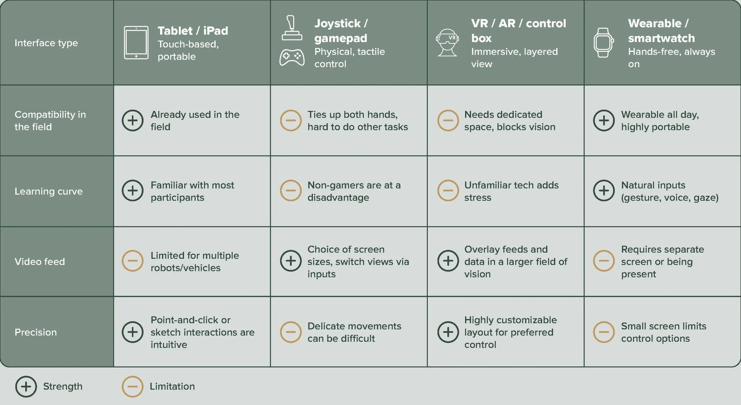
Pros and cons of different controller types
Existing examples
I also pulled several examples of equipment that used different controller interfaces, including a control app used to control a Bobcat machine that we were able to test in person. It was intuitive to pick up, but required a complicated setup where we requested support, had no video feed, and forced users to shift their gaze between the app and the machine. The real-world testing was useful for grounding our design decisions.
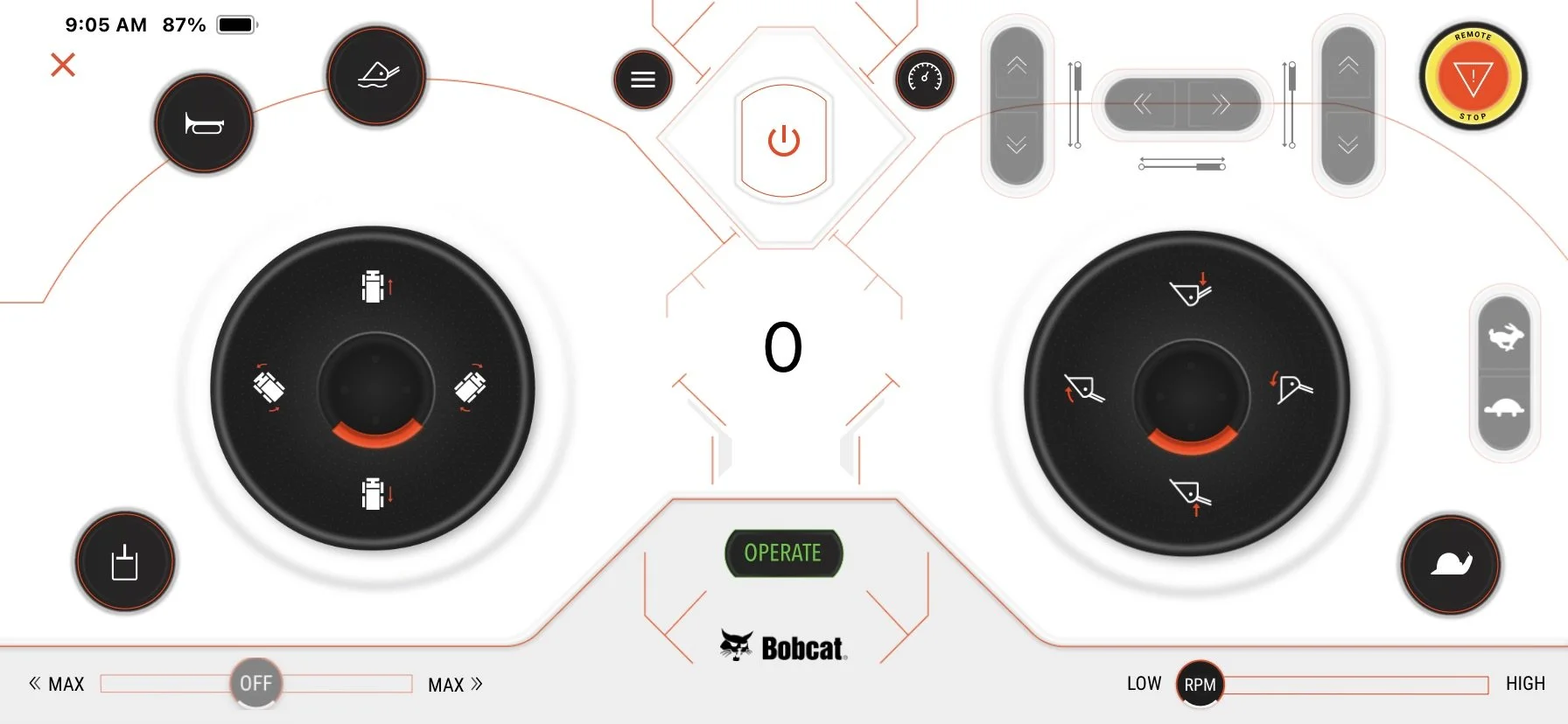
Bobcat controller app
Narrowing the scope
After a workshop with the client - including How Might We exercises and a prioritization session - we aligned on the first iteration: a “smart wheelbarrow” where users assign waypoints and the vehicle navigates and transports items autonomously, with basic manual controls when needed. The final feature scope ended up as:
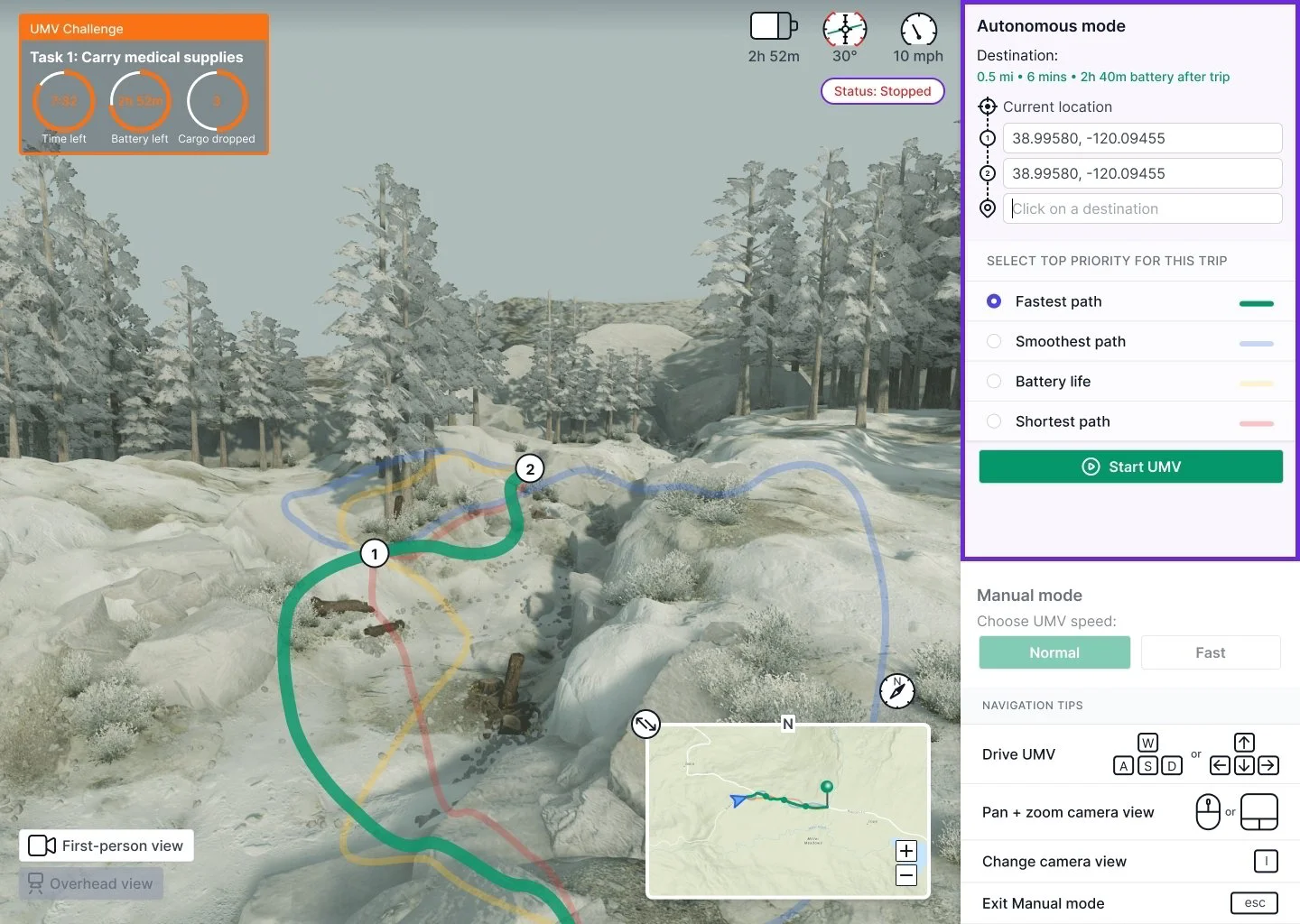
Simulation challenge UI: task number, time remaining, battery level, cargo drop count.
Waypoint selection via map pins, entering coordinates, or saved destinations.
Automated path selection, with tradeoff options: speed, stability, distance, battery life.
Basic manual mode: forward, reverse, left, right.
Camera view switching.
Designing the UI
Drafting the interface
The initial designs targeted an iPad interface with autonomous and manual modes. When the testing plan shifted to remote sessions, I moved to designing for a desktop UI to better suit remote testing and the simulation’s technical requirements.
Round 1 (iPad interface)
Round 2
Round 3 (Desktop interface)
Finalizing the UI
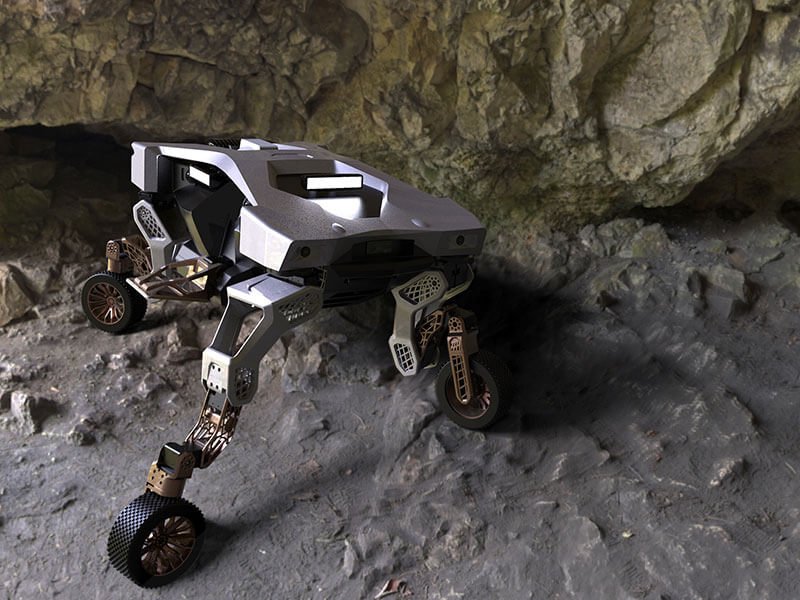
Before the simulation was ready, I recruited 4 more outdoor professionals to test the designs. I showed them an image of the vehicle and asked what they’d use it for, then had them react to the UI. Key changes based on their feedback:
The priority drag-and-drop list became a single priority path selection with a route preview - being able to see the distance and time of each path choice was easier as a first-time user.
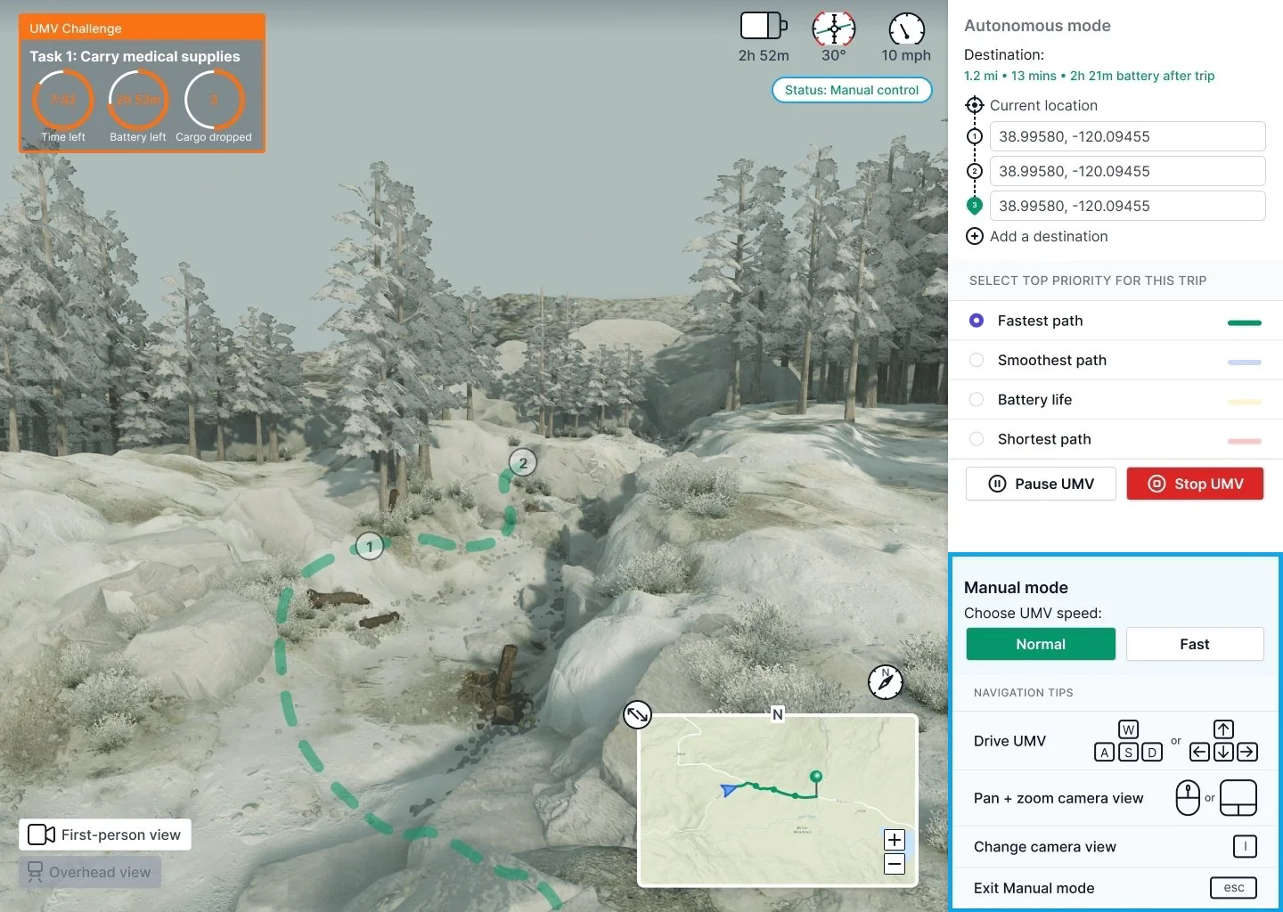
Autonomous and manual modes would now switch automatically when the user starts driving, with a quick toggle back to auto.
Controls updated from a joystick visual to keyboard for desktop use.
Vehicle status information was reorganized to sit more prominently at the top.
Final design - autonomous mode
Final design - manual mode
Final design - map view with multiple path previews
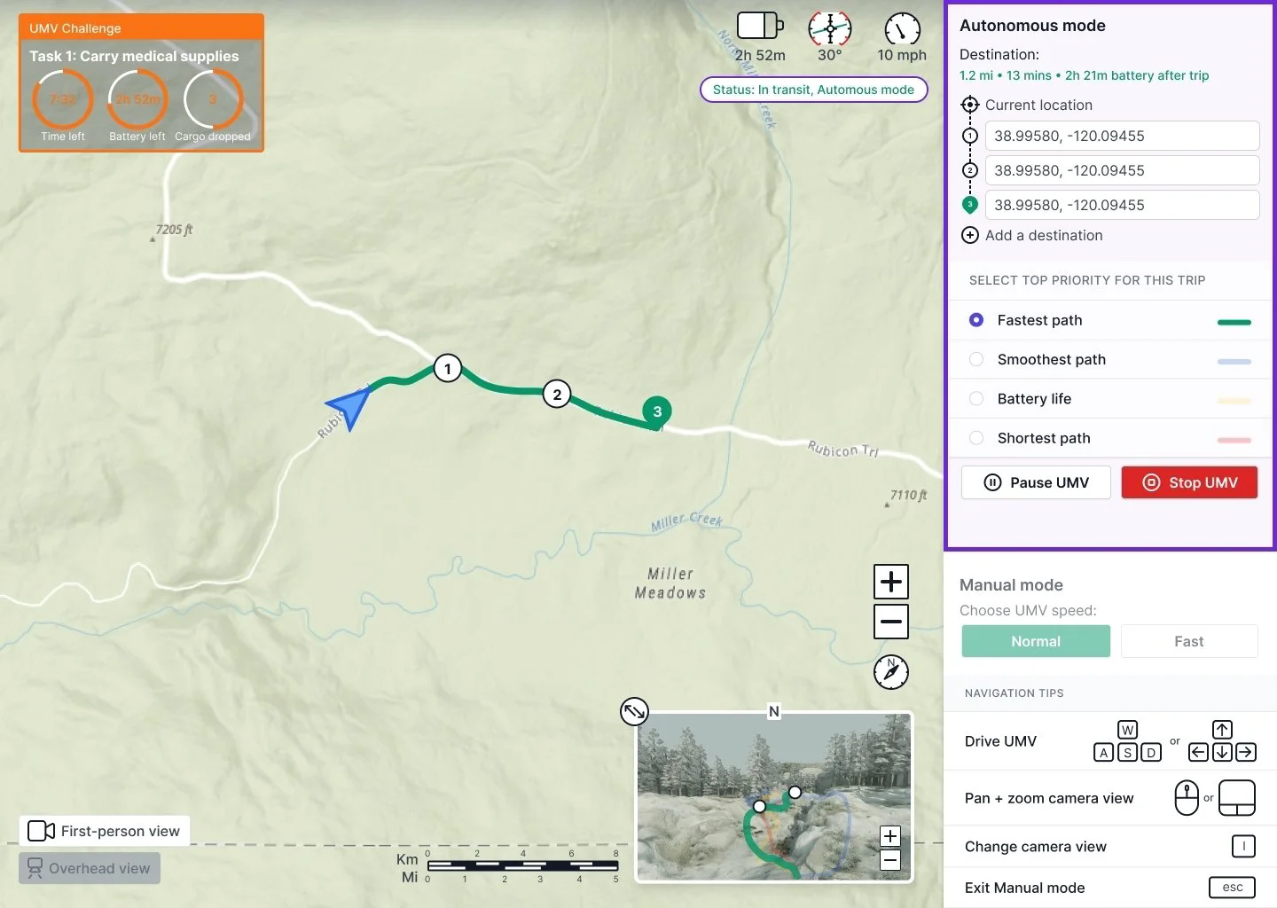
Final design - map view
Testing in the Rubicon Trail
Launching the simulation challenge
Engineers implemented a pared-down version of the UI for the simulation challenge due to time constraints. Users would be able to control a simulated vehicle using the interface in an environment modeled after the Rubicon Trail in Lake Tahoe. The key findings:
Users closely followed the suggested path and liked getting a preview before the vehicle set out.
Body-twisting controls went unused - users defaulted to simple left/right turns.
Walking mode felt more intuitive than driving, and aligned better with the goal of minimizing terrain disturbance.
The simulation challenge with a pared down version of the UI
Users could connect the vehicle to specific tasks or situations from their own work - search and rescue, supply transport, area scouting. As they explored the simulation, they also surfaced a wishlist of future capabilities. One unexpected finding: despite varying levels of tech savviness, many users assumed a joystick would give them finer control - a tension worth testing in a future round.
Wishlist of future features the users would like to see
The impact
Finding a clear route to success
The research gave Hyundai a focused direction: rather than just building a control UI for the vehicle, the project identified where the vehicle could have the most meaningful impact on people’s work.
Free up time and resources: the vehicle could take over tasks that currently take up people’s time from higher-value work, free up expensive resources like helicopters, and act as an additional responder for assessing calls before sending others out there.
Offload the hard parts of the job: the vehicle gives professionals more time for the work they actually enjoy by handling tedious, physically demanding, or dangerous tasks, while reducing strain and increasing safety.
How the vehicle can make an impact
Final design handoff
Before the end of the project, I delivered detailed specifications covering interaction behaviors, different UI states, and a tooltip layer, along with future scope documentation and features to support Hyundai’s continued development.
Figma file containing all the elements of the interface and specifications detailing how they would behave